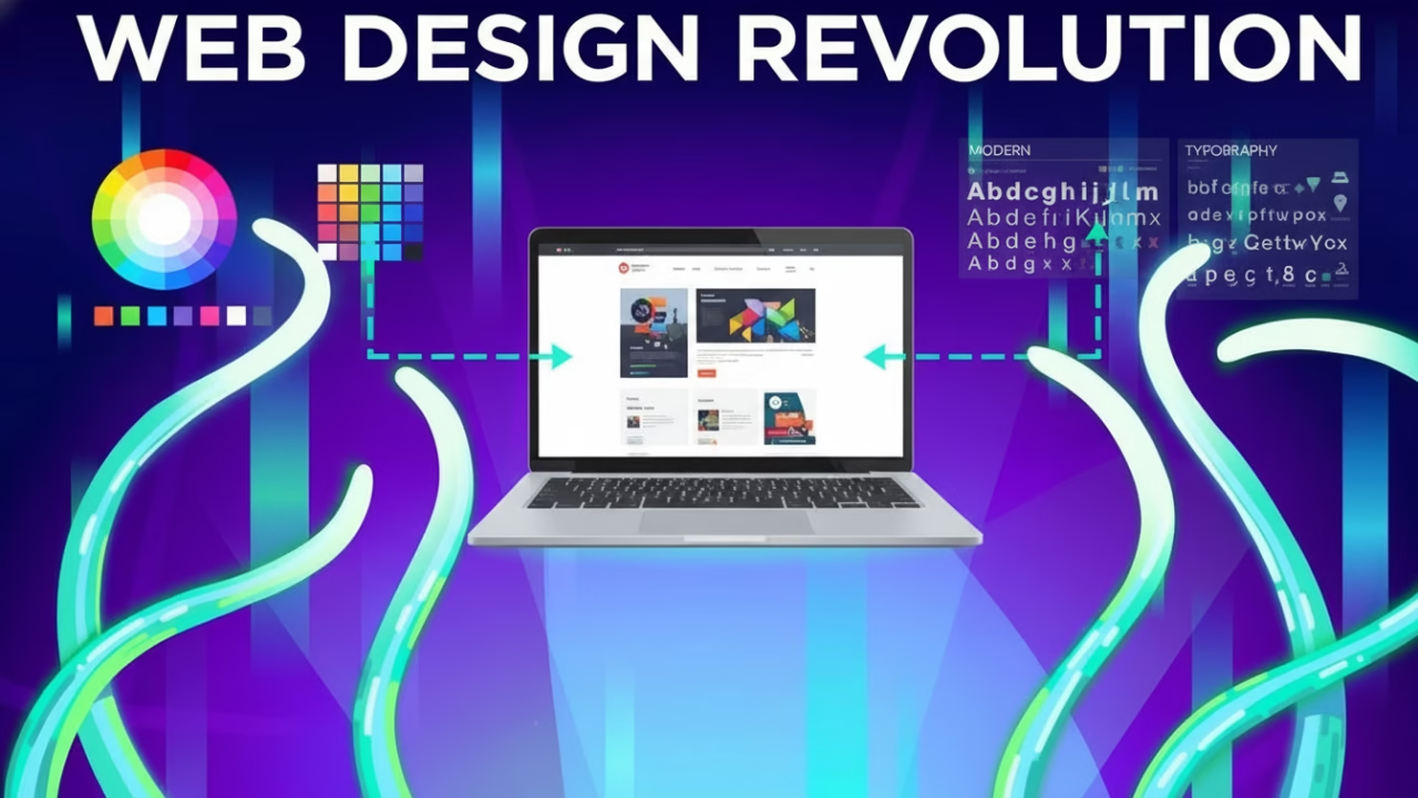
In the ever-evolving world of web design, staying current with the latest trends is crucial for creating engaging and visually appealing websites. Whether you’re seeking inspiration for cool website designs or aiming to develop the most awesome website design, understanding the latest trends will help you craft beautiful and effective online experiences. In this article, we’ll explore the key trends in modern website design that you should consider when building your next project.
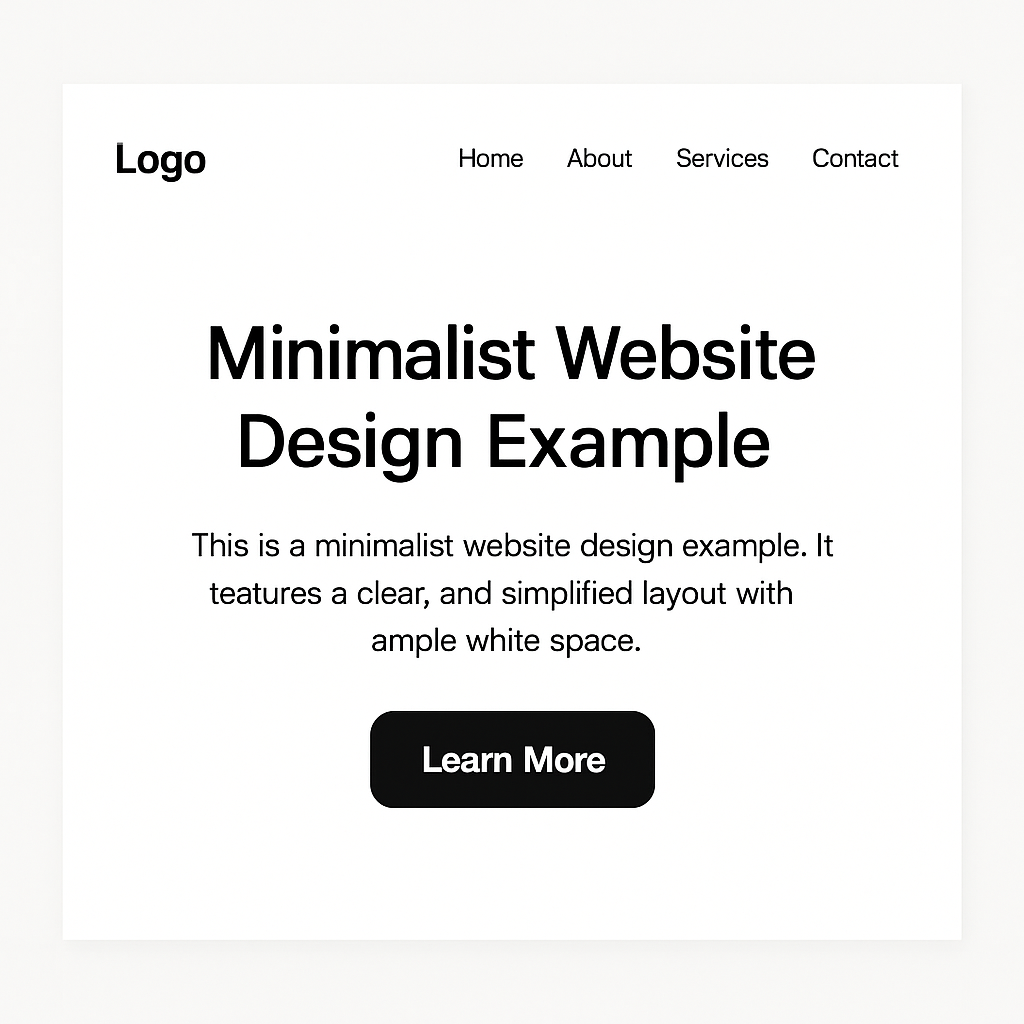
The minimalist design trend continues to dominate in the realm of modern web page design. This approach focuses on simplicity, using clean lines, ample white space, and a limited color palette to create a visually pleasing experience. Minimalist designs prioritize content and functionality, making them a popular choice for contemporary website design. By eliminating unnecessary elements, minimalist designs ensure that users can easily navigate and find the information they need.
Key Features of Minimalist Design
Minimalism is characterized by its clean and uncluttered appearance. Designers often use a monochromatic color scheme, with a splash of color for emphasis. This approach not only makes the website visually appealing but also enhances the user’s focus on the content. The use of ample white space is another key feature, providing breathing room for elements and contributing to a more organized layout.
Benefits of Minimalist Design
- Faster Load Times: With fewer elements to load, minimalist websites tend to have quicker load times, enhancing user experience. This speed is crucial in retaining users who are often impatient with slow-loading pages.
- Improved Usability: Simplified layouts make it easier for users to navigate and find content. The straightforward design reduces cognitive overload, allowing users to focus on what’s essential.
- Focus on Content: By removing distractions, the focus remains on the content, improving readability and engagement. This clarity helps communicate the brand message more effectively.
Challenges and Considerations
While minimalist design offers numerous benefits, it also comes with challenges. Maintaining visual interest with limited elements requires creativity. Designers must be strategic in selecting fonts, colors, and images to ensure the website remains engaging. Additionally, there is a risk of oversimplification, which can lead to a bland appearance if not executed thoughtfully.
Dark Mode
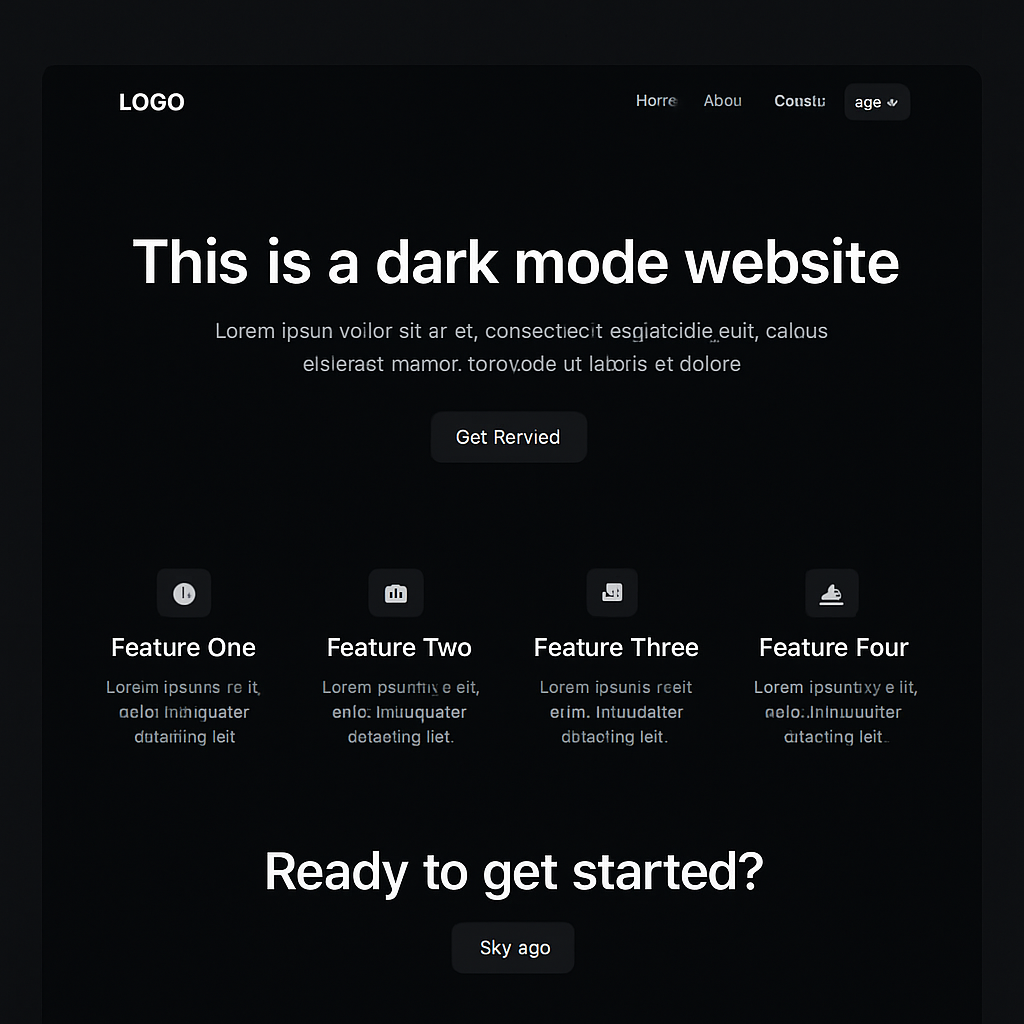
Dark mode has gained significant popularity in recent years, becoming a staple in many of the best internet site designs. This trend involves using a dark color scheme, typically with light text, to reduce eye strain and create a sleek, modern look. Dark mode is not only visually appealing but also energy-efficient for devices with OLED screens.
Why Users Love Dark Mode
Dark mode is favored for its aesthetic and practical benefits. It provides a modern, sophisticated look that many users find appealing. Moreover, its ability to reduce glare makes it easier on the eyes, especially during night-time browsing. This reduces eye fatigue, making it a preferred choice for users who spend prolonged periods online.
Advantages of Dark Mode
- Reduced Eye Strain: Dark mode is easier on the eyes, especially in low-light environments, making it a popular choice for late-night browsing. This feature is particularly beneficial for users who are sensitive to bright screens.
- Battery Conservation: On OLED screens, dark mode can help conserve battery life by using less power to display darker colors. This efficiency can prolong the device’s battery life, a significant advantage for mobile users.
- Aesthetic Appeal: Dark mode offers a modern and elegant look, adding a touch of sophistication to any website. Its sleek appearance can enhance a brand’s image, making it seem more cutting-edge.
Implementing Dark Mode
Integrating dark mode into a website requires careful consideration of color contrasts to ensure readability. Designers must choose complementary colors that maintain visibility while preserving the aesthetic appeal. Additionally, offering users the option to switch between light and dark modes can enhance user experience by providing customization options.
Microinteractions
Microinteractions are small, subtle animations or design elements that provide feedback to users as they interact with a website. These interactions can enhance user experience by making interfaces feel more responsive and engaging. From button animations to hover effects, microinteractions add an element of delight to modern web design.
The Role of Microinteractions
Microinteractions play a crucial role in enhancing user experience. They provide instant feedback, helping users understand the result of their actions. This immediate response can make interactions more intuitive, reducing user frustration and enhancing satisfaction.
Examples of Microinteractions
- Button Animations: Subtle changes in button appearance when hovered over or clicked. These animations provide visual feedback, confirming that an action has been registered.
- Loading Indicators: Animated icons or progress bars that inform users of ongoing processes. These indicators help manage user expectations by providing an estimated waiting time.
- Form Feedback: Instant validation messages when users fill out forms, confirming successful input. This feature reduces errors and enhances usability by guiding users through the form completion process.
Designing Effective Microinteractions
Creating effective microinteractions requires a balance between subtlety and visibility. Designers must ensure that these elements are noticeable enough to be helpful without overwhelming the user. Consistency in animation style and speed across the website can enhance coherence and user understanding.
3D Elements and Illustrations

by Buddha Elemental 3D (https://unsplash.com/@buddhaelemental3d)
Incorporating 3D elements and illustrations into web design is a trend that continues to capture attention. These elements add depth and realism to a website, making it stand out among the best-designed websites. With advancements in web technology, designers can seamlessly integrate 3D graphics into their projects, creating immersive experiences.
The Rise of 3D in Web Design
The use of 3D elements has become increasingly feasible with advancements in technology. WebGL and other tools have made it easier to implement 3D graphics without compromising performance. This trend allows designers to create more engaging and visually appealing websites.
Benefits of 3D Elements
- Visual Interest: 3D elements add a dynamic and interactive aspect to a website, capturing users’ attention. They can make a website more memorable by providing a unique visual experience.
- Enhanced Storytelling: 3D illustrations can help convey complex ideas and narratives in a visually compelling way. This capability can enhance the user’s understanding of the content, making it more impactful.
- Unique Branding: Custom 3D graphics can reinforce brand identity and differentiate a website from competitors. This differentiation can attract more visitors and increase brand recognition.
Challenges of 3D Integration
While 3D elements offer numerous advantages, they also present challenges. The increased load on resources can affect website performance, necessitating optimization to maintain speed. Additionally, designers must ensure that 3D elements are accessible and functional across different devices and browsers.
Voice User Interface (VUI)
As voice-activated devices become more prevalent, integrating a Voice User Interface (VUI) into websites is a trend gaining traction. VUI allows users to interact with a website using voice commands, providing a hands-free and accessible experience. This trend is particularly relevant for mobile-friendly and innovative web pages.
The Growing Popularity of VUI
The popularity of virtual assistants like Alexa and Google Assistant has paved the way for VUI in web design. Users are becoming more comfortable with voice commands, making VUI a valuable addition to enhance accessibility and convenience.
Advantages of VUI
- Accessibility: VUI makes websites more accessible to users with disabilities or those who prefer voice interaction. This inclusivity can broaden a website’s audience and improve user experience.
- Hands-Free Navigation: Users can browse and interact with a website without needing to touch their device, enhancing convenience. This feature is particularly beneficial for multitasking users who need to keep their hands free.
- Future-Proofing: As voice technology continues to evolve, incorporating VUI keeps websites on the cutting edge of innovation. Staying ahead of trends can ensure a website remains relevant and competitive.
Designing for VUI
Designing a VUI requires a focus on natural language processing to understand user commands accurately. Clarity and simplicity are crucial in crafting voice interactions that are intuitive and user-friendly. Additionally, providing a seamless transition between voice and traditional navigation can enhance overall user experience.
Asymmetrical Layouts
Asymmetrical layouts break away from traditional grid-based designs, offering a fresh and unique approach to web page design best practices. This trend involves creating visually interesting compositions by intentionally arranging elements off-center or unevenly. Asymmetrical layouts add a sense of movement and creativity to a website.
The Appeal of Asymmetry
Asymmetry introduces a sense of dynamism and spontaneity to web design. This approach can make a website appear more cutting-edge and less predictable, appealing to users seeking novelty and innovation.
Benefits of Asymmetrical Layouts
- Visual Dynamics: Asymmetrical designs create visual tension and intrigue, encouraging users to explore the website further. This exploration can increase engagement and time spent on the site.
- Creativity: This trend allows designers to experiment with unconventional layouts, resulting in distinctive and memorable websites. The freedom to break from traditional structures can foster innovation and creativity.
- Enhanced Storytelling: Asymmetrical compositions can guide users through a narrative or highlight specific elements of a website. This capability can enhance the user’s understanding and retention of information.
Balancing Asymmetry
While asymmetrical layouts offer creative freedom, they also require careful balance to maintain usability. Designers must ensure that the layout remains intuitive and that important information is easily accessible. Testing and iteration are crucial to achieving a harmonious and functional design.
Augmented Reality (AR) Integration
With the rise of augmented reality technology, integrating AR features into websites is a trend that’s gaining momentum. AR allows users to interact with digital content in the real world, creating immersive and interactive experiences. This trend is particularly relevant for e-commerce websites, where users can visualize products in their environment before making a purchase.
The Impact of AR on User Experience
AR transforms user interaction by blending digital content with the physical world. This immersive experience can increase engagement and provide users with a more comprehensive understanding of products and services.
Advantages of AR Integration
- Interactive Experiences: AR provides users with an interactive and engaging way to interact with a website’s content. This interactivity can make the website more memorable and enjoyable.
- Informed Decision-Making: For e-commerce sites, AR enables users to visualize products in their space, leading to more informed purchasing decisions. This feature can reduce returns and increase customer satisfaction.
- Brand Differentiation: Incorporating AR sets a website apart from competitors, showcasing innovation and cutting-edge technology. This differentiation can attract tech-savvy users and enhance brand image.
Implementing AR
Implementing AR requires careful consideration of user experience and technical feasibility. Designers must ensure that AR features are intuitive and accessible to all users. Additionally, optimizing performance and ensuring cross-device compatibility are crucial for successful integration.
Typography as a Design Element
Typography is more than just conveying information; it’s a powerful design element that can enhance a website’s aesthetics and usability. Modern web design embraces bold and creative typography to make a statement and guide users through the content.
The Power of Typography
Typography can significantly influence the overall look and feel of a website. Well-chosen fonts can convey a brand’s personality, evoke emotions, and guide users’ attention. This power makes typography a crucial component of effective web design.
Examples of Typography Trends
- Bold Headlines: Using large, bold fonts for headlines to capture attention and convey key messages. This trend can make important information stand out and enhance readability.
- Custom Fonts: Incorporating unique, custom fonts that reflect a brand’s personality and style. Customization can differentiate a brand and make the website more memorable.
- Text Overlays: Placing text over images or videos to create visually striking compositions. This technique can enhance visual appeal while conveying information effectively.
Balancing Typography and Design
While typography offers creative opportunities, it also requires careful balancing with other design elements. Designers must ensure that fonts are legible and that text complements the overall layout and aesthetic. Consistency in typography use can enhance coherence and user experience.
Conclusion
Staying up-to-date with the key trends in modern website design is essential for creating visually appealing, user-friendly, and innovative online experiences. From minimalist design and dark mode to microinteractions and augmented reality integration, these trends offer exciting opportunities for designers to push the boundaries of creativity.
Whether you’re seeking design inspiration websites or aiming to build the best-looking sites, embracing these trends will help you craft great design sites that leave a lasting impression on your audience. As technology continues to evolve, the possibilities for modern web design are limitless, ensuring that the future of web design remains both exciting and inspiring. By staying informed and adaptable, designers can continue to create websites that captivate and engage users in new and meaningful ways.