Headers are often the first thing visitors see when they land on your website. They serve as a gateway to your content and play a crucial role in shaping first impressions. A creative and well-thought-out header can make your site memorable and encourage users to explore further.
The Gateway to First Impressions
The header is the first visual contact point for users, acting as a digital handshake. This initial interaction is pivotal, as it determines whether users feel inclined to stay and explore or bounce off to another site. A compelling header design provides a snapshot of your brand’s essence and sets expectations for the content that follows.
Branding and Recognition
A header is more than just a navigational element; it’s a branding powerhouse. By incorporating your logo, color scheme, and typography, your header becomes a consistent and recognizable element across all your digital platforms. This consistency helps in building trust and recognition among your audience, fostering a sense of familiarity.
User Engagement and Navigation
An effective header design can significantly enhance user engagement by providing intuitive navigation. With strategic placement of elements like search bars, contact information, and social media icons, users can easily find what they need. This ease of navigation encourages deeper exploration of your site, increasing the likelihood of conversions.
By utilizing CSS, you have the power to create dynamic, interactive, and aesthetically pleasing headers without compromising the site’s performance. CSS allows for endless customization options, enabling you to tailor the design to match your brand and messaging.
Key Elements of Effective CSS Header Styles
Typography
Typography is a fundamental aspect of any header design. Choosing the right font can convey your brand’s personality and improve readability. For modern websites, consider using sans-serif fonts, which offer a clean and contemporary look.
Font Selection and Brand Identity
The choice of font in your header can speak volumes about your brand. Serif fonts may evoke a sense of tradition and reliability, while sans-serif fonts deliver a modern and clean appearance. Pairing complementary fonts can enhance visual hierarchy and guide users’ eyes to the most important information.
Readability and Accessibility
Ensuring readability across various devices and screen sizes is crucial. Opt for font sizes and line heights that facilitate easy reading, especially on smaller screens. CSS offers tools like media queries to adjust typography for different devices, enhancing accessibility for all users.
Typography Effects and Creativity
CSS provides a plethora of options for adding creative effects to your typography, such as shadows, outlines, and animations. These effects can add a dynamic element to your header, making it more visually engaging without overwhelming the user.
Color Scheme
The color scheme of your header should align with your brand’s identity while ensuring contrast with the background for better visibility. You can use CSS to create gradients, overlays, and even animations to make your header more engaging.
Brand Consistency Through Color
Colors are powerful communicators of brand identity. A well-chosen color palette in your header can evoke emotions and foster brand recognition. By consistently using brand colors, you strengthen brand identity and make your site more memorable.
Contrast and Legibility
High contrast between text and background colors is essential for legibility. CSS allows for adjustments in color contrast to ensure text is easily readable, which is especially important for accessibility. Tools like contrast checkers can help you choose the right combinations.
Dynamic Color Effects
CSS opens up a world of possibilities for dynamic color effects such as gradients and transitions. These effects can create a sense of movement and depth, capturing users’ attention and adding a modern flair to your design.
Layout and Structure
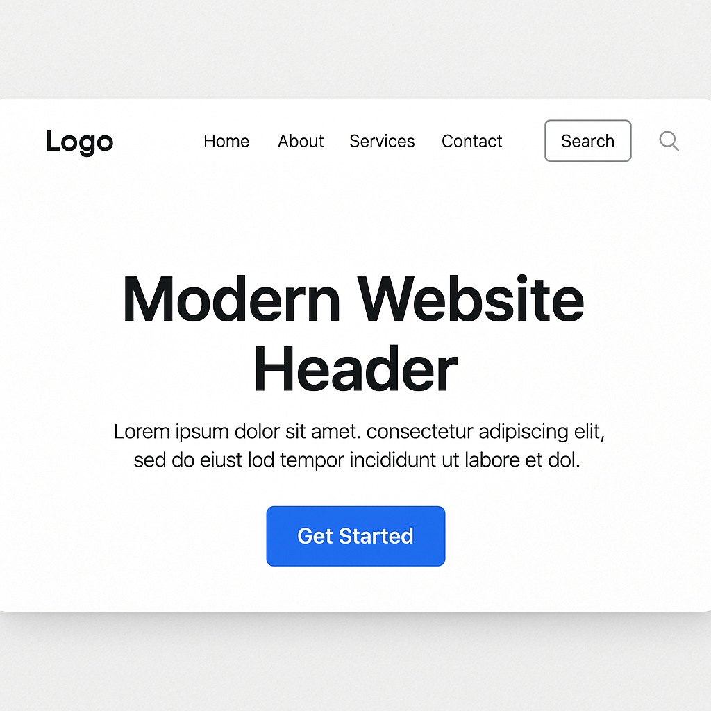
A well-structured header should be intuitive and easy to navigate. Consider including elements like navigation menus, logos, and call-to-action buttons. Use CSS Flexbox or Grid for a responsive layout that adapts to different screen sizes.
Flexibility with Flexbox
CSS Flexbox is a powerful tool for creating flexible and efficient layouts. It allows you to design headers that are responsive and maintain their structure on any device. Flexbox’s ability to align and distribute space among items makes it ideal for complex header designs.
Grid Layouts for Precision
For more intricate layouts, CSS Grid provides a framework for precisely positioning elements. This tool is particularly useful for headers with multiple components, ensuring each element is perfectly aligned and proportional.
Intuitive Navigation Design
An effective header layout enhances user experience by offering intuitive navigation. By strategically placing navigation links and call-to-action buttons, users can effortlessly find their way around your site. CSS enables you to create hover and focus effects that guide user interactions.
Creative CSS Header Styles to Try
Parallax Scrolling Header
Parallax scrolling adds an illusion of depth by having the background move at a slower pace than the foreground. This effect can create a visually stunning header that draws users in. With CSS, you can achieve this effect by using background-attachment: fixed; and manipulating the background position.
Creating Depth and Dimension
Parallax scrolling introduces a sense of depth, making your header more immersive. This technique can create a storytelling experience, drawing users into the narrative of your site. By adjusting the speed of the background relative to the foreground, you can achieve a layered look that captivates visitors.
Implementing Parallax with CSS
CSS enables the parallax effect through properties like background-attachment and background-position. By fixing the background image and adjusting its position as the user scrolls, you create a seamless and engaging visual experience. This effect can be enhanced with subtle animations for a more polished appearance.
Enhancing User Experience
While parallax scrolling is visually appealing, it’s important to ensure it doesn’t hinder usability. Test the effect across different devices to maintain performance and accessibility. Parallax should complement your content, not overshadow it, so balance is key.
Full-Screen Video Header
Incorporating a video in your header can make a strong impact. Videos can convey a story or showcase products effectively. Use CSS to overlay text or buttons on the video and ensure it remains responsive across devices.
Storytelling Through Video
A full-screen video header can serve as a powerful storytelling tool. Whether you’re showcasing a product, sharing a brand story, or creating an emotional connection, video can communicate complex ideas quickly and effectively. This dynamic medium can capture attention and set the tone for the entire site.
CSS Techniques for Video Integration
CSS provides tools for seamlessly integrating video into your header. By using properties like object-fit and position, you can ensure the video covers the entire header area without distortion. Overlaying text or buttons with CSS allows for interactive elements that enhance user engagement.
Responsiveness and Performance
Ensuring video headers are responsive is crucial for maintaining a positive user experience. CSS media queries can adjust video size and quality based on device capabilities, ensuring smooth playback. Optimize video files for web use to reduce loading times and avoid performance issues.
Animated Gradient Header
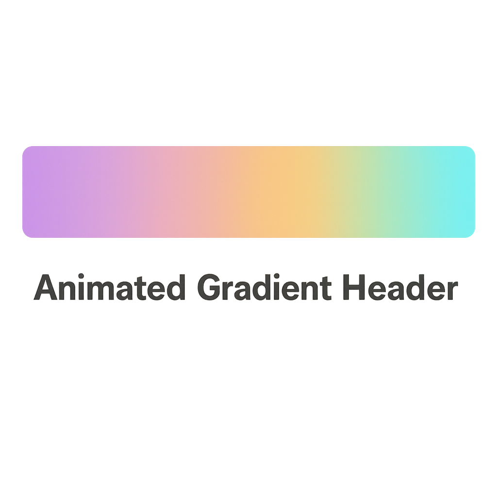
Gradients are a popular trend in modern web design. By adding animation to gradients, you can create a dynamic header that captures attention. CSS allows you to animate gradients using @keyframes and background-image.
The Allure of Gradients
Gradients add a modern and sophisticated touch to web design. They create visual interest by blending colors seamlessly, adding depth and dimension. An animated gradient header can captivate users with its dynamic transitions, keeping their attention focused on the content.
Implementing Animation with CSS
CSS @keyframes allow you to animate gradients, creating smooth transitions between colors. By defining keyframes, you can control the timing and direction of the animation, resulting in a visually engaging experience. This technique can highlight important elements or simply add a decorative touch.
Balancing Animation and Usability
While animated gradients are visually appealing, it’s important not to overwhelm users. Ensure animations are subtle and do not distract from the core content. Test the performance impact across different devices to maintain fast loading times and a seamless user experience.
Sticky Header with Scroll Animation
A sticky header remains visible as users scroll down the page, offering constant access to navigation links. Enhance this feature by adding scroll animations using CSS transitions. This not only improves usability but also adds a touch of sophistication to your site.
The Benefits of Sticky Headers
Sticky headers enhance navigation by keeping important links accessible as users scroll. This feature can significantly improve user experience on long pages, allowing users to easily navigate without scrolling back to the top. Sticky headers contribute to a seamless browsing experience.
Adding Elegance with Scroll Animations
Scroll animations can add elegance to sticky headers, making the transition smooth and visually appealing. CSS transitions allow you to animate the appearance and disappearance of the header, adding a layer of sophistication. This subtle touch can enhance the overall aesthetic of your site.
Ensuring Performance and Accessibility
While sticky headers and animations are beneficial, it’s crucial to prioritize performance and accessibility. Test the impact on page loading times and ensure the header remains functional on all devices. Provide alternative navigation options for users who rely on assistive technologies.
Minimalist Header with Hover Effects
A minimalist design focuses on simplicity and functionality. Use CSS to create subtle hover effects on navigation links or buttons. This approach keeps the design clean while providing interactive elements that enhance user experience.
The Appeal of Minimalism
Minimalism in web design emphasizes simplicity and clarity. A minimalist header can create a sense of elegance and focus, allowing content to take center stage. By reducing visual clutter, you enhance user experience and make navigation intuitive.
Enhancing Interaction with Hover Effects
CSS hover effects add interactivity to minimalist designs without compromising simplicity. By incorporating subtle animations or color changes, you can guide user interactions and highlight important elements. These effects enhance usability while maintaining a clean aesthetic.
Balancing Simplicity and Functionality
A minimalist header must balance simplicity with functionality. Ensure all necessary elements are included, such as navigation links and branding, without overwhelming users. Test the design across different devices to maintain consistency and ensure a seamless experience.
Implementing CSS Header Styles: Best Practices
Responsive Design
Ensure your header design is responsive and adapts to various screen sizes. Use media queries to adjust styles for mobile devices and test across different browsers for consistency.
Adapting to Diverse Devices
Responsive design is essential in today’s multi-device world. By using media queries, you can adjust your header’s layout, typography, and elements to suit different screen sizes. This ensures a consistent and user-friendly experience across desktops, tablets, and smartphones.
Testing for Consistency
Consistency across browsers is key to maintaining a professional appearance. Test your header design in various browsers to ensure it renders correctly and provides a seamless experience for all users. Address any inconsistencies promptly to maintain a polished look.
Future-Proofing Your Design
As new devices and screen sizes emerge, maintaining a responsive design becomes even more crucial. Regularly update your CSS to accommodate changes and ensure your header remains functional and visually appealing in the future.
Performance Optimization
While creative designs are important, it’s crucial to maintain optimal loading times. Minimize the use of heavy images or videos and leverage CSS to achieve effects that would otherwise require additional assets.
Prioritizing Speed
Website speed is a critical factor in user experience and search engine rankings. Optimize your header design by using lightweight images, compressing files, and minimizing HTTP requests. CSS can replace certain visual effects, reducing the need for large assets.
Leveraging CSS for Efficiency
CSS offers efficient ways to achieve visual effects without relying on external files. By using CSS animations, gradients, and transitions, you can create engaging designs while keeping the page lightweight. This approach enhances performance and improves user satisfaction.
Monitoring and Testing
Regularly monitor your site’s performance to identify areas for improvement. Use tools like Google PageSpeed Insights to assess loading times and receive optimization recommendations. Continuous testing ensures your header design remains fast and efficient.
Accessibility Considerations
Make your header accessible to all users by ensuring sufficient contrast between text and background, providing alternative text for images, and enabling keyboard navigation.
Ensuring Visual Accessibility
Visual accessibility is crucial for all users, including those with visual impairments. Ensure sufficient contrast between text and background colors to enhance readability. CSS provides tools for adjusting contrast and ensuring compliance with accessibility standards.
Supporting Assistive Technologies
Make your header accessible to users relying on assistive technologies by providing alternative text for images and ensuring keyboard navigation. Use semantic HTML and ARIA attributes to enhance the accessibility of interactive elements.
Inclusive Design Practices
Adopt inclusive design practices by considering the needs of diverse users. Test your header design with screen readers and other assistive technologies to identify and address accessibility issues. An inclusive approach ensures all users can access and navigate your site effectively.
Tools and Resources for Creative CSS Header Designs

by sarah b (https://unsplash.com/@sixthcitysarah)
To assist you in creating stunning CSS header styles, consider using the following tools and resources:
- CodePen: An online community for testing and showcasing user-created HTML, CSS, and JavaScript code snippets. It’s a great place to experiment and find inspiration for your header designs.
- CSS-Tricks: A website dedicated to providing tips and tricks for using CSS effectively. It offers tutorials, guides, and forums for CSS enthusiasts and developers.
- Google Fonts: A library of free, open-source fonts that you can use to enhance your header typography. With a wide range of styles, you can find the perfect font to match your brand’s personality.
Conclusion
Incorporating creative CSS header styles into your modern website can significantly enhance its visual appeal and user experience. By focusing on elements like typography, color schemes, and layout, you can create a header that not only attracts attention but also aligns with your brand’s identity. Experiment with various styles and stay updated with the latest trends to keep your website looking fresh and engaging.
Remember, the key to a successful header design lies in balancing creativity with functionality, ensuring that your website remains both attractive and user-friendly. With the right approach, your CSS header can become a powerful tool in captivating your audience and leaving a lasting impression.