
Before diving into the actual process of building a website without a website builder, it’s important to grasp some fundamental concepts of web design. Understanding these basics will make the process smoother and more rewarding.
Core Web Technologies You Need to Learn

HTML (Hypertext Markup Language), CSS (Cascading Style Sheets), and JavaScript are the three core technologies for building web pages. Understanding these technologies at a basic level is crucial for anyone looking to build a website without a website builder.
- HTML: HTML is the foundation of any web page. It structures your content by using various elements like headings, paragraphs, lists, and images. Understanding HTML is essential because it dictates how your content is displayed on the web.
- CSS: CSS is what makes your website visually appealing. It allows you to apply styles to your HTML elements, such as colors, fonts, and layout designs. CSS is crucial for creating a consistent look and feel across your website, which enhances user experience.
- JavaScript: JavaScript brings your website to life by adding interactivity. It enables features like dynamic content updates, form validations, and interactive maps. Mastering JavaScript will help you create a more engaging and responsive user experience.
Web Design Principles to Keep in Mind

In addition to understanding the technologies, grasping web design principles is essential. These principles guide the aesthetics and usability of your website.
- Usability: Websites should be easy to navigate and intuitive. This means having a clear structure, easy-to-read fonts, and accessible navigation menus.
- Visual Hierarchy: This principle involves arranging elements to guide users naturally through the content. Use size, color, and spacing to emphasize important information.
- Consistency: Maintaining a consistent style throughout your website helps in creating a professional and cohesive look. It involves using the same colors, fonts, and design elements across all pages.
With the increasing use of mobile devices, having a responsive design is crucial. Responsive design ensures that your website looks good on all devices, whether it’s a desktop, tablet, or smartphone.
- Fluid Grids and Layouts: Instead of fixed layouts, use fluid grids that adjust according to screen size. This ensures that your website maintains its structure across different devices.
- Media Queries: CSS media queries allow you to apply different styles based on the device’s characteristics, such as screen width. This helps in tailoring the user experience for different screen sizes.
- Responsive Images: Optimize images to load quickly and display correctly on various devices. Use techniques like responsive image tags and image compression to enhance performance.
Planning Your Website
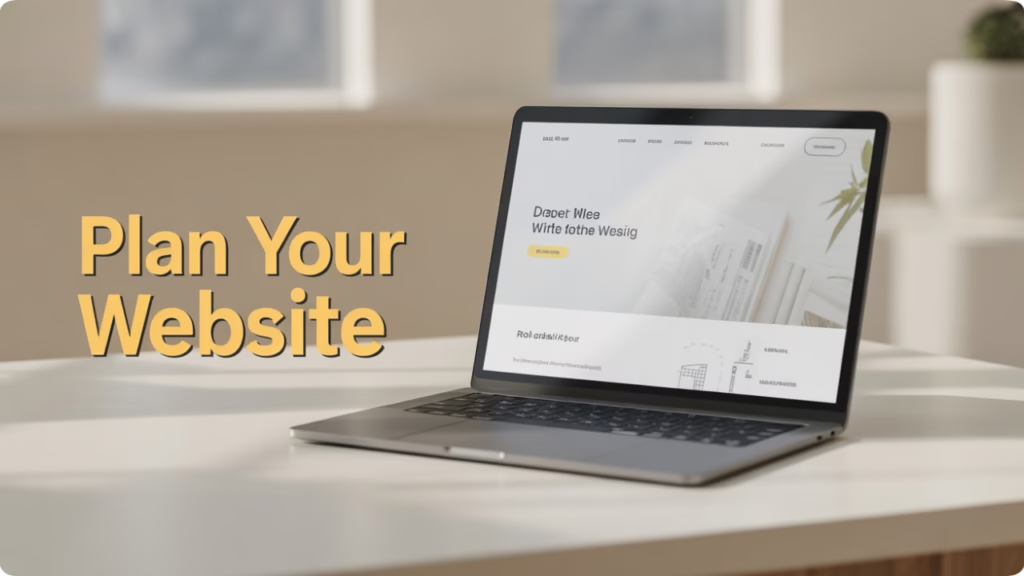
Before you start coding, it’s important to have a clear plan for your website. This includes defining its purpose, target audience, and the key features it should have.
Purpose and Objectives
Ask yourself what you want your website to achieve. Clear goals will guide your design and content decisions.
- Purpose of the Website: Determine whether your website is for personal use, a business, an online portfolio, or a blog. This will influence the features and design you choose.
- Primary Objectives: Establish clear objectives, such as increasing brand awareness, generating leads, selling products, or providing information. These goals will shape your content strategy and user experience.
- Success Metrics: Decide how you will measure the success of your website. This could be through metrics like website traffic, conversion rates, or user engagement.
Sketching the Layout
Create a rough sketch of your website layout. This will serve as your blueprint when coding your site.
- Wireframes: Start with wireframes, which are simple sketches of your website’s layout. This helps in visualizing the placement of elements like headers, navigation menus, and footers.
- Design Mockups: Once you have a basic layout, create detailed design mockups. These include colors, fonts, and images, providing a preview of the final design.
- User Flow Diagrams: Map out the user journey through your website. This ensures that navigation is intuitive and that users can easily find the information they need.
Preparing Content and Media
Prepare the text, images, and other media you plan to use on your website. Having all your content ready will make the development process more efficient.
- Content Strategy: Develop a content strategy that aligns with your website goals. This includes deciding on the type of content you’ll create, such as blog posts, product descriptions, or case studies.
- Content Organization: Organize your content into categories and subcategories. This helps in creating a clear content structure that enhances user experience.
- Media Assets: Collect high-quality images, videos, and other media that complement your content. Ensure they are optimized for web use to improve loading times.
Setting Up Your Development Environment
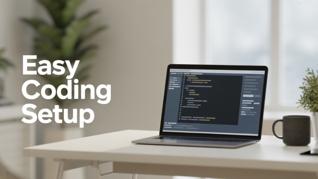
To start building your website, you need a proper development environment. This consists of a text editor, a browser, and optionally, some development tools.
Choosing a Code Editor
A text editor is where you’ll write your HTML, CSS, and JavaScript code. Popular options include:
- VSCode: A free, open-source editor with a wide range of plugins and features. It’s known for its versatility and extensive community support.
- Sublime Text: Known for its speed and simplicity, Sublime Text is favored by many developers for its performance and ease of use.
- Atom: Another free editor with extensive customization options. Atom is highly flexible and allows developers to tailor their environment to their needs.
Browser Developer Tools
You’ll need a web browser to test your website. Modern browsers like Chrome, Firefox, and Edge come with developer tools that allow you to inspect and debug your code.
- Chrome Developer Tools: Offers a suite of tools for inspecting HTML, CSS, and JavaScript. It’s invaluable for debugging and optimizing your website.
- Firefox Developer Edition: Tailored for web developers, it provides powerful tools for performance analysis and debugging.
- Edge DevTools: Offers similar features to Chrome and Firefox, with additional tools for testing your site on Windows devices.
Using a Local Server
While not strictly necessary, a local server like XAMPP or MAMP can simulate a web server environment on your computer. This is useful for testing dynamic features and server-side scripts.
- XAMPP: A cross-platform local server that includes Apache, MySQL, PHP, and Perl. It’s ideal for testing complex web applications locally.
- MAMP: Specifically designed for macOS, MAMP provides a local server environment for testing PHP and MySQL applications.
- Benefits of Local Servers: They offer a controlled environment for testing changes without affecting your live website. This is essential for experimenting with new features and debugging issues.
Building Your Website Step by Step
With your development environment set up, it’s time to start building your website. We’ll break down the process into manageable steps.
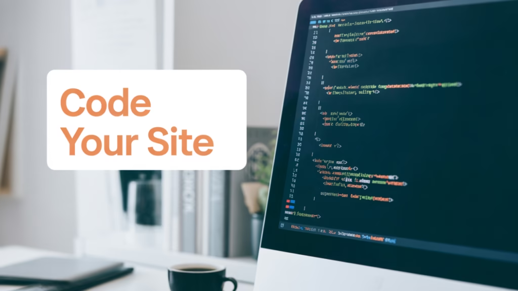
Creating the HTML Structure
Start by creating an HTML file, typically named index.html. This file will serve as the main entry point for your website.
- Structuring Content: Use HTML tags to define the structure of your page, including headings, paragraphs, lists, images, and links. A well-structured HTML document is crucial for accessibility and SEO.
- Semantic HTML: Use semantic HTML elements, like
<header>,<main>,<article>,<section>, and<footer>, to provide meaning to your content. This improves SEO and accessibility. - Meta Tags: Include meta tags for character encoding, viewport settings, and SEO. These tags ensure your site is displayed correctly and is discoverable by search engines.
Styling with CSS
Create a separate CSS file (e.g., styles.css) and link it to your HTML file. Use CSS to style the elements and layout of your website.
- External Stylesheets: Link your CSS file to your HTML to keep your design and content separate. This makes your code more manageable and reusable.
- CSS Selectors and Properties: Use selectors to target HTML elements and apply styles. Mastering CSS properties like color, font-size, and margin is essential for creating a polished design.
- Responsive Design Techniques: Implement responsive design techniques, such as flexible grid layouts and media queries, to ensure your site looks good on all devices.
Enhancing with JavaScript
JavaScript can enhance your website by adding dynamic elements and interactivity.
- DOM Manipulation: Learn to manipulate the Document Object Model (DOM) to create dynamic content. This involves adding, removing, and modifying HTML elements in response to user interactions.
- Event Handling: Use JavaScript to handle events, such as clicks or form submissions. This allows you to create interactive features like drop-down menus and modal windows.
- Form Validation: Implement client-side validation to ensure that users submit valid data. This improves user experience by providing instant feedback.
Testing Your Website

Once your website is built, it’s time to test it across different browsers and devices to ensure consistent performance. Fix any bugs or layout issues you encounter.
Ensure your website functions correctly on all major browsers. This involves checking for compatibility issues and fixing them.
- Cross-Browser Testing Tools: Use tools like BrowserStack or CrossBrowserTesting to test your site on different browsers and devices. This helps identify compatibility issues early.
- Responsive Testing: Test your website on various screen sizes to ensure it adapts to different devices. This is crucial for providing a seamless user experience.
- Accessibility Testing: Ensure your site is accessible to all users, including those with disabilities. Use tools like aXe or Lighthouse to evaluate your site’s accessibility.
Going Live: Hosting and Deployment

To make your website accessible online, you need to host it on a web server.
- Choosing a Hosting Provider: Select a hosting provider that suits your needs, whether it’s shared hosting, VPS, or cloud hosting. Consider factors like cost, scalability, and support.
- Uploading Files: Use an FTP client or the hosting provider’s dashboard to upload your files. Ensure your directory structure is correct to avoid errors.
- Domain Configuration: Configure your domain name to point to your hosting server. This involves setting DNS records and ensuring SSL certificates are in place for security.
Conclusion
Building a website without a website builder requires a bit of effort and learning, but it offers the flexibility to create a truly unique and tailored online presence. By understanding the basics of HTML, CSS, and JavaScript, planning your site, and setting up the right development environment, you can build a website from scratch that serves your needs and stands out from the rest.
Whether you’re creating a personal blog, a portfolio site, or a small business page, the knowledge and skills you gain from this process will be invaluable in your digital journey. Embrace the challenge and enjoy the creative freedom that comes with designing your own website from the ground up.