A lot of new websites look clean, load quickly, and have all the right pages — but still don’t get clicks, enquiries, or sign-ups.
In most cases, the issue isn’t traffic. It’s that visitors don’t know what to do next, especially on key pages like your homepage.
When I review WordPress sites, I often see pages that explain things well but don’t guide users toward an action. There’s no clear button, no next step, or the call to action is too vague to matter.
This is where calls to action (CTAs) come in. They turn passive visitors into active users.
Table of Contents
Quick Answer / Summary
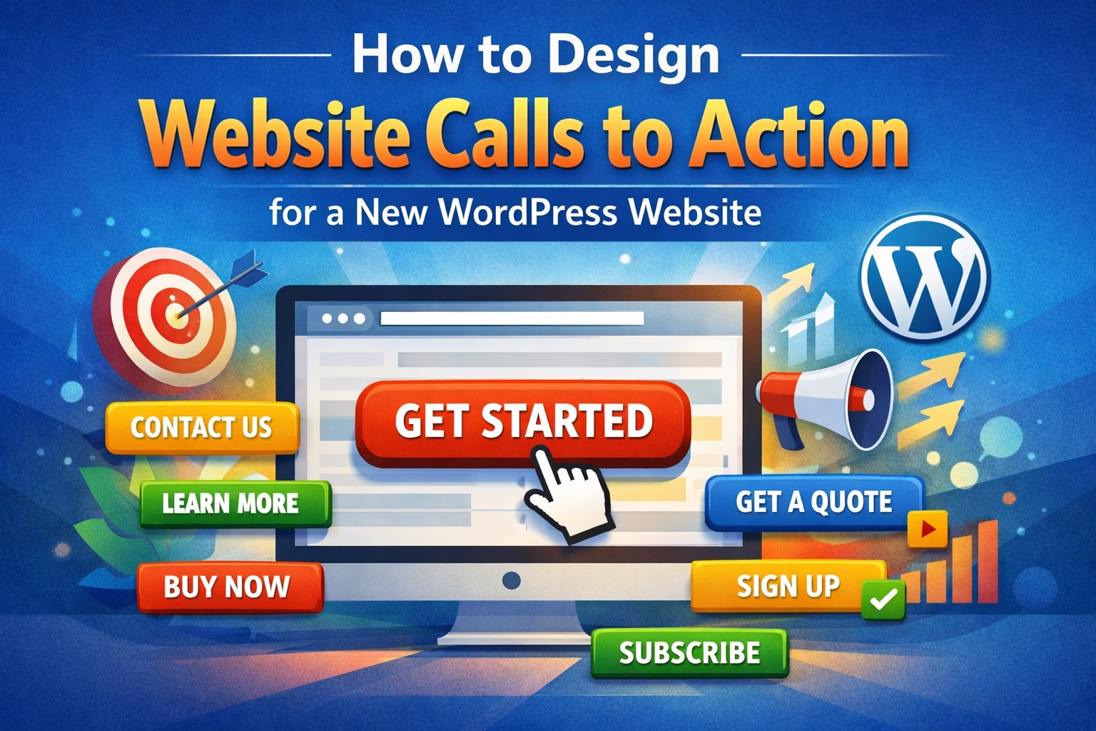
A good call to action on a WordPress website should be clear, visible, and specific. It should tell visitors exactly what to do next (for example, “Contact Us”, “Get a Quote”, or “View Services”) and be placed in key areas such as the header, homepage sections, and at the end of content.
Why This Matters
Without clear calls to action, users hesitate. Even if your content is good, they leave without taking the next step.
Strong CTAs improve:
- Contact form submissions
- Service enquiries
- Page engagement
- Overall conversion rate
In my experience, even small changes to button text or placement can noticeably improve how people interact with a site.
Step-by-Step: How to Design Effective Calls to Action
1. Decide the Primary Action for Your Website
Before adding buttons, you need to define what you actually want users to do.
Common primary actions include:
- Contact you
- Request a quote
- Book a service
- Read more content
- View a specific page
Most websites should have one main action, not five competing ones.
If everything is important, nothing stands out.
2. Write Clear and Specific Button Text
Avoid vague text like:
- “Click here”
- “Learn more”
Instead, use action-focused wording:
- “Get a Quote”
- “Contact Us”
- “View Services”
- “Start Your Website”
When I set this up on WordPress sites, I usually choose wording that matches the user’s intent rather than the business’s internal language.
For example:
- A visitor wants help → “Get Help” works better than “Submit Enquiry”
3. Place CTAs Where Users Expect Them
Placement matters just as much as wording.
Key locations:
- Header (top navigation or button)
- Homepage hero section
- After key sections (services, benefits)
- End of blog posts
- Contact page
A common issue I see is a single CTA buried at the bottom of a page. Many users never scroll that far.
4. Make the CTA Visually Stand Out
Your call to action should not blend into the page.
Focus on:
- Contrast (button color vs background)
- Size (large enough to notice)
- Spacing (not crowded by other elements)
If everything on the page is visually equal, nothing gets attention.
In most sites I build, I use one primary button style and keep it consistent across the entire website.
5. Keep One Primary CTA Per Section
Each section should guide the user toward one action.
For example:
- Homepage hero → “Get Started”
- Services section → “View Services”
- Blog post → “Read More” or “Contact Us”
Too many buttons create hesitation and reduce clicks.
6. Add CTAs to Your WordPress Pages
In WordPress, you can add calls to action in several ways:
Block Editor (Gutenberg) — you can use the Buttons block to create calls to action directly in your content.
- Use the Buttons block
- Place it after key content sections
Page Builders (Elementor, etc.)
- Use button widgets
- Position CTAs inside sections or columns
Theme Settings
- Add a header button (often “Contact” or “Get Started”)
This is usually quick to implement, but placement and wording matter more than the tool you use.
7. Use CTAs to Guide Page Flow
A good page should naturally lead to a call to action.
For example:
- Explain the problem
- Show your solution
- Add CTA (“Get a Quote”)
If the CTA appears randomly, it feels disconnected.
Practical Tips from Real Sites
- Keep CTA wording consistent across pages
- Use one main color for primary buttons
- Repeat your main CTA multiple times on longer pages
- Match CTA wording to the page content (don’t use the same button everywhere blindly)
One thing I regularly notice is that simple changes — like switching “Submit” to “Get a Quote” — can improve engagement without changing anything else.
Common Mistakes
1. Too many CTAs on one page
This confuses users and reduces clicks.
2. Weak or generic wording
“Submit” or “Click here” doesn’t give users a reason to act.
3. Poor visibility
Buttons that blend into the design get ignored.
4. No CTA at all
Some pages explain everything but never ask the user to take action.
5. Inconsistent CTAs across the site
Different wording and styles reduce clarity and trust.
When to Use This vs Alternatives
CTAs work best when your goal is to guide users toward a clear next step.
However:
- Informational blog posts may use softer CTAs like “Read Next”
- Content-heavy sites may rely more on internal links than buttons
- Landing pages may use stronger, repeated CTAs for conversions
In practice, most websites need a mix:
- Primary CTA (conversion-focused)
- Secondary CTA (navigation or content flow)
Conclusion
Calls to action are what turn a website from something people read into something they use.
Keep them clear, visible, and focused on one main action. Place them where users naturally look, and match the wording to what visitors actually want to do.
Most sites don’t need more content — they need better direction.

Etienne Basson works with website systems, SEO-driven site architecture, and technical implementation. He writes practical guides on building, structuring, and optimizing websites for long-term growth.