When someone clicks a link from an ad, email, or search result, they usually expect one specific thing. Not a full website with menus and distractions, but a focused page that answers their question or pushes them toward a single action.
That’s where landing pages come in. On many WordPress sites I review, this is the missing piece. The homepage tries to do everything (see how to write homepage copy), blog posts attract traffic but don’t convert well, and there’s no dedicated page designed to turn visitors into leads or customers.
In most sites I build, landing pages are used for very specific goals: capturing email signups, promoting a service, or sending paid traffic somewhere that actually converts. Without them, you’re often losing value from traffic you already have.
Quick Answer / Summary
To create a landing page in WordPress, you build a focused page with one goal, remove distractions like navigation menus, structure it with clear sections (headline, benefits, call to action), and publish it as a standalone page or campaign URL.
You can create it using the WordPress block editor or a page builder, then optimize it for conversions and basic SEO.
Why This Matters
A standard website page spreads attention across multiple links and options. A landing page does the opposite. It reduces choices and guides the visitor toward one action.
This matters in situations like:
- Running ads (Google Ads, social media)
- Promoting a specific service
- Collecting email subscribers
- Launching a product or offer
In my experience, even simple landing pages outperform regular pages when the goal is conversion. It’s not about design complexity, it’s about focus and structure.
Step-by-Step Instructions
1. Define the Goal of the Landing Page
Before creating anything in WordPress, decide what the page is supposed to do.
Common goals include:
- Get contact form submissions
- Sell a product or service
- Capture email signups
- Book consultations
Stick to one goal. If a page tries to do multiple things, it usually performs worse.
2. Create a New Page in WordPress
In your dashboard:
- Go to Pages → Add New
- Give it a clear title (for example: “Free Website Checklist” or “Book a Consultation”)
You can keep the title simple. In many cases, the visible headline on the page will matter more than the WordPress title itself.
3. Set a Clean Layout (Remove Distractions)
Landing pages work best without:
- Full navigation menus
- Sidebar widgets
- Too many links
Depending on your theme:
- Use a full-width or blank template
- Disable header/footer if your theme allows it
- Or use a page builder for more control
When I set this up on WordPress sites, I usually aim for the simplest layout possible. The more focused the page, the better it tends to convert.
4. Build the Core Structure
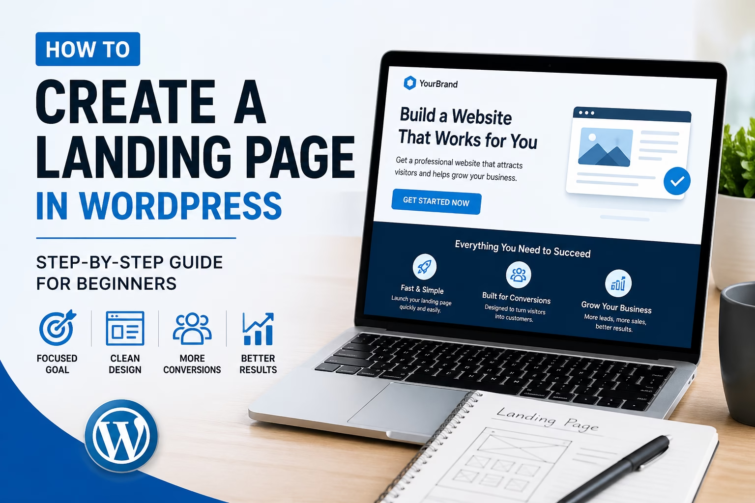
A good landing page usually follows a simple structure:
Headline (Top Section)
- Clear and specific
- Focused on the benefit
Example:
“Get a Simple Website Setup Checklist for Your First WordPress Site”
Supporting Text
- Brief explanation of what the visitor gets
- Why it’s useful
Call to Action (CTA)
- Button or form
- Action-focused wording like:
- “Download the Checklist”
- “Get Started”
- “Book a Call”
Benefits Section
- Short bullet points explaining what the user gains
Trust Elements
- Testimonials
- Results
- Simple credibility signals
Final CTA
- Repeat the main action at the bottom
You don’t need a long page. You need a clear one.
5. Add a Form or Action Element
Depending on your goal:
- Use a contact form plugin
- Add an email newsletter signup form
- Link to a booking tool
- Or use a simple button leading to checkout
Make sure:
- The form is easy to complete
- There are no unnecessary fields
In most cases, shorter forms perform better.
6. Optimize for Mobile
A large portion of traffic will come from mobile devices.
Check:
- Text is readable
- Buttons are easy to tap
- Sections are not too long
I often see landing pages that look fine on desktop but feel awkward on mobile. This alone can reduce conversions.
7. Set the Permalink
Use a clean and simple URL, for example:
/create-landing-page-wordpress/(for informational content)/free-checklist/(for an actual offer)
Short URLs are easier to share and remember.
8. Publish and Test the Page
Before using the page:
- Click through it yourself
- Test the form
- Check links
- View it on mobile
If you’re sending traffic to it (ads or email), small issues can have a big impact. Once the page is live, it’s also worth learning how to A/B test landing pages in WordPress so you can improve conversions based on real visitor behavior instead of guesses.
Practical Tips and Observations
In most WordPress sites I work on, a few patterns show up:
- Pages with fewer links perform better
- Clear headlines outperform clever ones
- Repeating the CTA improves conversions
- Simple layouts are easier to maintain
I usually recommend starting with a basic layout and improving it later rather than trying to build a complex page upfront.
Also, if you’re using plugins or page builders, keep performance in mind. Heavy pages can slow down load times, which affects both SEO and conversions.
Common Mistakes
1. Treating It Like a Normal Page
Adding menus, blog links, and multiple navigation options reduces focus.
2. No Clear Call to Action
If the visitor doesn’t know what to do next, they leave.
3. Too Much Text
Long explanations without structure can overwhelm users.
4. Weak Headline
The headline is often the first thing people read. If it’s vague, the rest of the page doesn’t matter.
5. Ignoring Mobile Layout
A large portion of users won’t see the desktop version.
6. Sending Traffic to the Homepage Instead
This is very common. Ads and campaigns should usually go to a dedicated landing page, not the homepage.
When to Use This vs Alternatives
Use a landing page when:
- You have a specific campaign or offer
- You want a focused conversion goal
- You are running ads or email campaigns
Use a regular page when:
- You need general site navigation (like service pages)
- The visitor needs to explore multiple sections
- SEO content is the main goal (like blog posts)
If your goal is directly selling a product, service, or offer, you may also want to read this guide on how to create a sales page in WordPress.
In my experience, both have their place. Landing pages are not replacements for your main site structure, they’re a focused addition.
Conclusion
A landing page in WordPress is simply a focused page built around one goal. Remove distractions, keep the structure clear, and guide the visitor toward a single action.
You don’t need complex tools to start. A clean layout, clear message, and simple call to action are usually enough to get results.

Etienne Basson works with website systems, SEO-driven site architecture, and technical implementation. He writes practical guides on building, structuring, and optimizing websites for long-term growth.