When people build their first WordPress site, they usually focus on themes, plugins, and content. Design decisions like colors and fonts often get rushed at the end, or left to whatever the theme defaults to.
That works technically, but it’s one of the main reasons new websites look unfinished or inconsistent. I see this a lot when reviewing sites — good structure, decent content, but the visual side makes it harder to trust or read.
In most sites I build, I treat colors and fonts as part of the setup phase, not something to fix later. Getting this right early saves time and avoids having to redesign everything once the site grows. The same applies to visuals — see how to choose website images and visuals for your website for a complete guide.
Table of Contents
Quick Answer / Summary
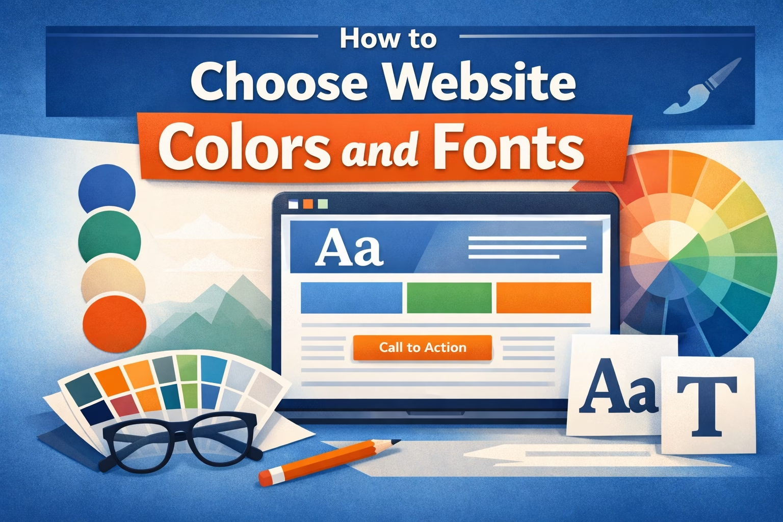
Choose 1 primary color, 1–2 supporting colors, and 1 accent color, then pair them with 1–2 fonts (one for headings, one for body text).
Focus on:
- Readability first (especially body text)
- Consistency across pages
- Simple combinations over complex styling
If you keep your design simple and consistent, your site will already look more professional than most beginner websites.
Why This Matters
Colors and fonts affect how people use your site more than most technical settings.
- Poor contrast makes content hard to read
- Too many fonts make pages feel disorganized
- Inconsistent colors reduce trust
- Overly styled designs slow down decision-making for visitors
From an SEO and usability perspective, this matters because:
- Visitors stay longer when content is easy to read
- Clear visual hierarchy helps users scan pages
- A consistent design improves overall user experience
In practice, this directly affects bounce rate and engagement.
Step-by-Step: How to Choose Website Colors
Step 1: Pick a Primary Color
Your primary color is the main color used across your site (buttons, links, highlights).
If you already have a logo, use a color from it. If not, choose something simple and neutral.
In most WordPress sites I build, I recommend:
- Blue (trust, common for business sites)
- Green (services, growth, finance)
- Neutral dark tones (clean, modern look)
Avoid choosing something too bright or difficult to read against white backgrounds.
Step 2: Add Supporting Colors
Choose 1–2 supporting colors that work with your primary color.
These are used for:
- Background sections
- Secondary buttons
- Subtle highlights
A simple approach:
- One light color (for backgrounds)
- One darker tone (for contrast)
You don’t need more than this for most websites.
Step 3: Choose an Accent Color
Your accent color is used sparingly to draw attention.
Use it for:
- Call-to-action buttons
- Important links
- Key highlights
The goal is contrast. If everything stands out, nothing stands out.
Step 4: Test for Readability
Before finalizing colors, check (you can also use tools like Coolors to test palettes quickly):
- Text on background contrast
- Button visibility
- Link readability
Black or dark gray text on a white background is still the safest option for body content.
Step-by-Step: How to Choose Website Fonts
Step 1: Choose a Body Font First
Your body font matters more than your heading font because it’s used the most.
Look for:
- Clean, simple fonts
- Good spacing and readability
- Common web-safe options
In most cases, I use:
- Sans-serif fonts like Arial, Inter, or Open Sans
Avoid decorative fonts for body text.
Step 2: Choose a Heading Font
Your heading font can add personality, but it should still be readable.
You can:
- Use the same font as body text (safe option)
- Or use a slightly different font for contrast
Keep it simple. Two fonts is enough for most websites.
Step 3: Set Font Sizes and Hierarchy
Make sure your text structure is clear:
- Large headings (H1, H2)
- Medium subheadings (H3)
- Comfortable body text size
In most sites I build, I increase body font size slightly above theme defaults because it improves readability immediately.
Step 4: Check Mobile Readability
Always check fonts on mobile:
- Is text easy to read without zooming?
- Are headings too large?
- Is spacing comfortable?
Many design issues only show up on smaller screens.
Practical Tips (From Real Site Builds)
- I usually keep color palettes minimal — most sites don’t need more than 3–4 colors total
- Neutral backgrounds (white, light gray) make everything easier to manage
- If you’re unsure, simplify rather than add more styling
- Consistency matters more than creativity for most business websites
- Use your accent color only for actions (like buttons), not decoration
One simple improvement I often make on existing sites is reducing the number of colors and fonts. It immediately makes the site look more structured.
Common Mistakes to Avoid
Using too many colors
This creates visual noise and makes the site feel unstructured.
Low contrast text
Light gray text on white backgrounds might look clean, but it reduces readability.
Too many fonts
More than two fonts usually makes the site feel inconsistent.
Over-styling headings
Heavy styling, colors, and effects on headings can reduce clarity.
Relying entirely on theme defaults
Themes are generic by design. A few adjustments make a big difference.
When to Keep It Simple vs Customize More
Keep It Simple If:
- You’re building your first website
- You don’t have a defined brand yet
- Your goal is clarity and usability
Customize More If:
- You already have brand guidelines
- You’re building a design-focused site
- You’re working with a designer
In most beginner and business websites, simple and consistent design performs better than complex styling.
Conclusion
Choosing colors and fonts for a WordPress website doesn’t need to be complicated.
Focus on:
- A small, consistent color palette
- One or two readable fonts
- Clear contrast and hierarchy
If your site is easy to read and visually consistent, you’re already ahead of most new websites.

Etienne Basson works with website systems, SEO-driven site architecture, and technical implementation. He writes practical guides on building, structuring, and optimizing websites for long-term growth.