The checkout page is where your store either makes money or loses it.
I’ve seen well-designed WooCommerce stores with solid traffic still struggle because the checkout feels confusing, cluttered, or untrustworthy. People add products to their cart, but they hesitate when they reach the final step. That hesitation often comes down to small details—too many fields, unclear payment options, or a layout that doesn’t feel secure. If your payment setup or shipping configuration isn’t clear, it’s worth reviewing how WooCommerce payments, shipping, and taxes are set up before optimizing the checkout itself.
When I set up WooCommerce sites, the checkout page is one of the last things I refine before launch. It’s also one of the most important. Even simple adjustments can improve conversions without changing anything else on the site.
Quick Answer / Summary
To customize the WooCommerce checkout page, you can:
- Adjust built-in WooCommerce settings (payments, shipping, guest checkout)
- Edit checkout fields using plugins or custom code
- Improve layout and trust signals (logos, policies, secure indicators)
- Simplify the process by removing unnecessary steps
Most beginners get the best results by combining WooCommerce settings with a lightweight checkout customization plugin.
Why This Matters
The checkout page directly affects whether visitors complete their purchase. Before customers even reach checkout, it also helps to customize the WooCommerce cart page so the transition into checkout feels simple and consistent.
A complicated checkout can:
- Increase cart abandonment
- Reduce trust
- Confuse users on mobile devices
A clean, simple checkout:
- Speeds up the buying process
- Builds confidence
- Improves conversion rates
In most sites I build, simplifying the checkout has a bigger impact than redesigning the homepage.
Step-by-Step Instructions
1. Review WooCommerce Checkout Settings
Start with the built-in options before installing anything. WooCommerce already provides a solid checkout foundation, and you can review WooCommerce’s official guidance on managing orders after checkout if you want to understand what happens once a customer completes a purchase.
Go to:
WooCommerce → Settings → Accounts & Privacy
Check these settings:
- Enable guest checkout (reduces friction)
- Allow customers to create an account after purchase
- Keep account creation optional
Then go to:
WooCommerce → Settings → Payments
- Enable only the payment methods you actually need
- Remove unnecessary options (too many choices slow users down)
Why this matters:
Too many options and forced account creation are common reasons users abandon checkout.
2. Simplify Checkout Fields
By default, WooCommerce includes many fields that aren’t always necessary.
You can:
- Remove company name if you don’t need it
- Remove address line 2 if not required
- Hide phone number if optional
The easiest way to do this is with a plugin such as:
- Checkout Field Editor for WooCommerce
- Flexible Checkout Fields
When I set this up on WordPress sites, I usually aim for the shortest possible form without breaking delivery or payment requirements.
3. Optimize the Checkout Layout
WooCommerce checkout can feel crowded, especially on mobile.
You can improve it by:
- Using a single-column layout (better for mobile)
- Keeping order summary visible
- Reducing visual clutter (extra banners, widgets, popups)
Some themes and page builders allow direct checkout customization. Otherwise, plugins like:
- WooCommerce Checkout Manager
- CartFlows
can help restructure the layout.
Why this matters:
Users should immediately understand where to enter details and how to complete the purchase.
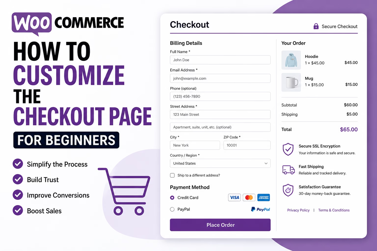
4. Add Trust Signals
Trust plays a big role at checkout.
Simple additions include:
- SSL (HTTPS) enabled site
- Payment icons (Visa, PayPal, etc.)
- Short reassurance text (e.g., “Secure checkout”)
- Links to:
- Privacy Policy
- Terms and Conditions
- Refund policy
In my experience, adding clear trust signals often improves conversions more than design changes.
5. Configure Shipping and Taxes Clearly
Confusion around shipping is a major drop-off point.
Make sure:
- Shipping costs are shown early
- Delivery times are clear
- Taxes are transparent
Go to:
WooCommerce → Settings → Shipping
- Set up zones properly
- Avoid unexpected costs at the final step
Why this matters:
Unexpected fees at checkout are one of the top reasons users abandon their cart.
6. Test the Checkout Process
Before launching, go through the full process yourself.
Test:
- Desktop and mobile
- All payment methods
- Guest checkout
- Error handling (missing fields, wrong details)
I usually run at least 2–3 full test orders to catch small issues that aren’t obvious at first glance.
Practical Tips or Observations
- Shorter checkout forms almost always perform better
- Mobile experience matters more than desktop for most stores
- Removing distractions (popups, banners) helps focus users
- Autofill and saved details improve completion rates
One thing I often see is store owners trying to “add more” to checkout—extra offers, upsells, messages. Most of the time, this hurts conversions instead of helping.
Common Mistakes
1. Too many required fields
Users don’t want to fill out unnecessary information.
2. Forcing account creation
This creates friction, especially for first-time buyers.
3. Hiding total cost until the end
Unexpected costs lead to abandoned carts.
4. Overloading checkout with design elements
Keep it clean and focused.
5. Not testing mobile checkout
A checkout that works on desktop may feel broken on mobile.
When to Use This vs Alternatives
Customizing the default WooCommerce checkout works well for most sites.
However, consider alternatives if:
- You want a high-converting funnel-style checkout → tools like CartFlows
- You need advanced upsells or one-click offers → funnel plugins
- You’re running paid ads → optimized landing + checkout flows may perform better
For standard stores, the default WooCommerce checkout with a few improvements is usually enough.
Conclusion
The WooCommerce checkout page doesn’t need a full redesign to perform better.
Focus on:
- Removing unnecessary fields
- Keeping the layout simple
- Adding trust signals
- Making costs clear
In most cases, small adjustments lead to noticeable improvements in conversions.

Etienne Basson works with website systems, SEO-driven site architecture, and technical implementation. He writes practical guides on building, structuring, and optimizing websites for long-term growth.