A lot of new websites look fine on a desktop but fall apart on a phone. Text feels too small, buttons are hard to tap, menus don’t work properly, and pages require zooming just to read anything. This usually happens because mobile usability wasn’t considered during setup.
In most sites I build, mobile traffic quickly becomes the majority of visitors. Even simple business websites often see more than half of their traffic coming from phones. If the site is difficult to use, people leave quickly, and that affects both conversions and search rankings.
Creating a mobile-friendly WordPress website isn’t complicated, but it does require attention to layout, readability, and usability from the start. If you also want to improve how fast your site loads on mobile, see how to improve WordPress speed and mobile performance.
Quick Answer / Summary
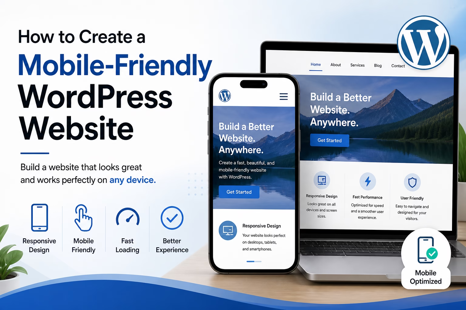
To create a mobile-friendly WordPress website, you need a responsive theme, readable text sizes, properly spaced buttons, a simple mobile menu, optimized images, and regular testing on real devices or browser tools.
Why This Matters
Mobile usability directly affects how long people stay on your site and whether they take action. It also impacts SEO, since search engines evaluate how well a page works on smaller screens.
In my experience, most mobile issues come from small design decisions rather than major technical problems. Fixing them early makes the entire site easier to use and maintain.
Step-by-Step Instructions
1. Choose a Responsive WordPress Theme
Start with a theme that automatically adjusts to different screen sizes.
Most modern themes are responsive, but not all are well-optimized. A good theme should:
- Resize content without breaking layouts
- Stack sections cleanly on smaller screens
- Keep menus usable on mobile
When I set up WordPress sites, I always preview themes on both desktop and mobile before choosing one.
2. Check Mobile View in the Customizer
Go to:
Appearance → Customize
Use the mobile preview option to see how your site looks on smaller screens.
Look for:
- Text that’s too small
- Sections that feel cramped
- Images that overflow or look distorted
This step helps you catch layout issues early before publishing pages.
3. Use Readable Text Sizes
Small text is one of the most common problems.
A good starting point:
- Body text: at least 16px
- Headings: clearly larger and spaced properly
Avoid forcing users to zoom. If text isn’t readable at normal size, it needs adjustment.
4. Make Buttons Easy to Tap
On mobile, users interact with their fingers, not a mouse.
Buttons should:
- Be large enough to tap easily
- Have space around them
- Be clearly visible
I usually recommend avoiding small links placed too close together. This is a frequent issue on service pages and landing pages.
5. Simplify Navigation for Mobile
Desktop menus don’t always translate well to mobile.
Use a clean mobile menu (often called a hamburger menu) and:
- Limit the number of menu items
- Keep labels short and clear
- Avoid deep dropdown structures
In most sites I build, simplifying navigation improves both usability and conversions.
6. Optimize Images for Mobile
Large images can slow down mobile pages and affect layout.
Make sure to:
- Resize images before uploading
- Use compressed formats
- Avoid unnecessarily large hero images
This improves loading speed and keeps the layout stable.
7. Check Spacing and Layout
Mobile screens need more breathing room.
Look at:
- Padding between sections
- Space between text and images
- Margins around buttons
Tight layouts that look fine on desktop often feel cluttered on mobile.
8. Test Your Website on Real Devices
Preview tools are useful, but real testing is better.
Check your site on:
- A smartphone
- A tablet (if possible)
Also use browser tools like Chrome DevTools to simulate different screen sizes.
9. Use Google’s Mobile-Friendly Test (Optional)
You can use external tools like Google’s Mobile-Friendly Test to identify issues.
This helps catch:
- Text that’s too small
- Elements too close together
- Content wider than the screen
It’s not something I rely on daily, but it’s useful for quick checks.
Practical Tips or Observations
- In my experience, simpler designs almost always perform better on mobile
- Avoid sidebars unless they collapse cleanly
- Long paragraphs are harder to read on phones—keep them shorter
- Sticky headers can help navigation, but make sure they don’t take too much space
When reviewing websites, I often find that mobile issues are not technical problems—they’re design choices that didn’t account for smaller screens.
Common Mistakes
Using a non-responsive theme
Older or poorly built themes don’t adapt properly to mobile.
Making text too small
If users need to zoom, the design isn’t working.
Overloading the menu
Too many items make navigation harder on small screens.
Placing buttons too close together
This leads to accidental clicks and frustration.
Ignoring mobile testing
Relying only on desktop previews misses important usability issues.
When to Use This vs Alternatives
A mobile-friendly WordPress setup is enough for most websites, including blogs, business sites, and portfolios.
You might consider alternatives if:
- You’re building a complex web app (custom development may be better)
- You need advanced mobile-specific features (a dedicated app could be more suitable)
For standard websites, responsive design in WordPress is the most practical approach.
Conclusion
A mobile-friendly WordPress website comes down to a few key areas: responsive design, readable content, usable navigation, and proper testing.
If you focus on how the site feels on a phone rather than just how it looks on a desktop, you’ll avoid most common issues and create a better experience for visitors from the start.

Etienne Basson works with website systems, SEO-driven site architecture, and technical implementation. He writes practical guides on building, structuring, and optimizing websites for long-term growth.