
When you build a new WordPress site, it’s easy to make design decisions as you go. You pick a color for a button, choose a font for headings, adjust spacing on one page… and before long, nothing feels consistent.
I see this a lot when reviewing websites. The homepage looks polished, but blog posts use different fonts, buttons change styles across pages, and spacing feels uneven. It doesn’t break the site, but it makes everything look less professional.
A simple website style guide solves this early. It gives you a clear set of design rules so every page looks consistent, even as your site grows.
Quick Answer / Summary
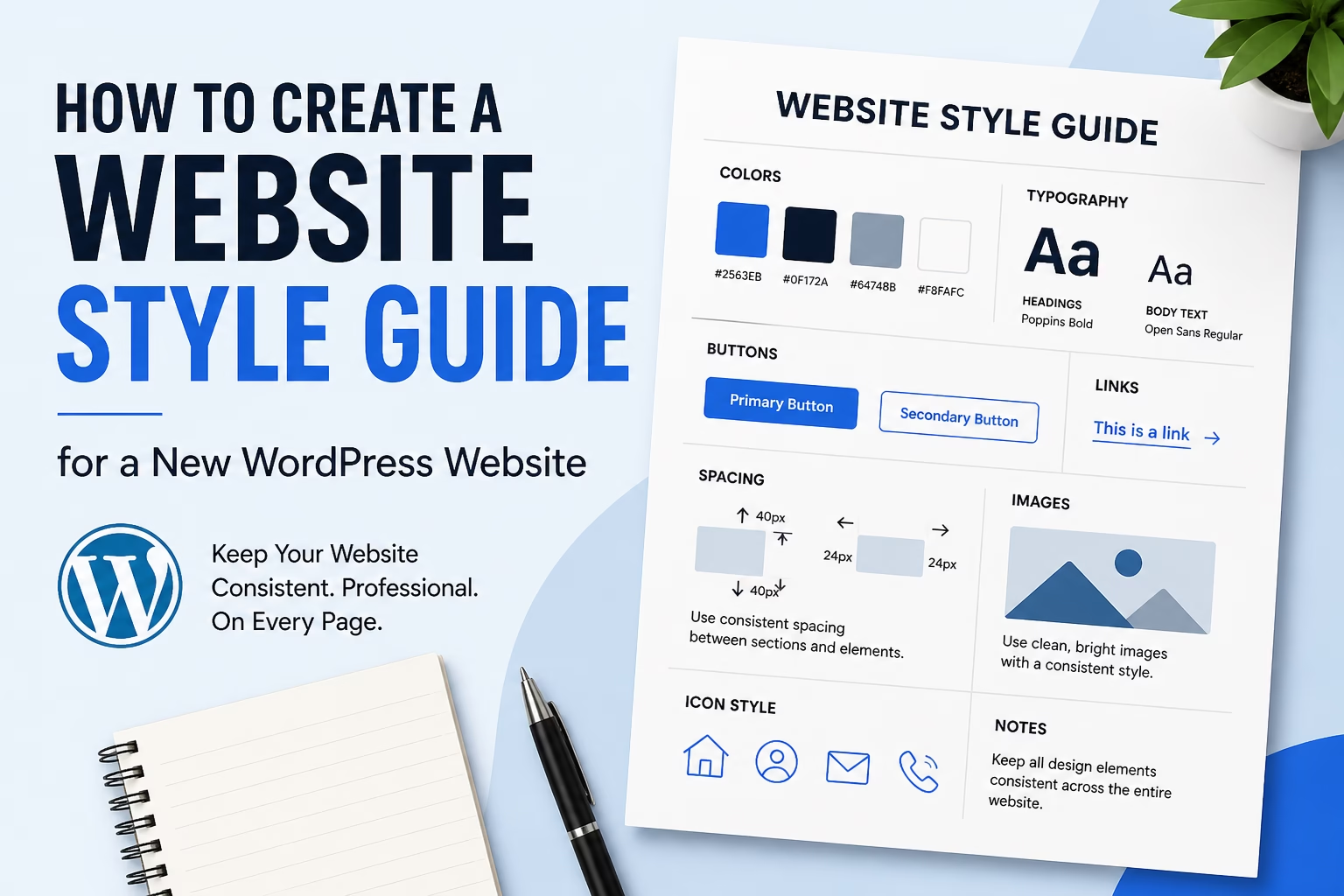
A website style guide is a simple document that defines your site’s visual rules—colors, fonts, buttons, spacing, and image styles—so your WordPress website stays consistent across all pages.
You don’t need anything complex. A basic style guide can be created in one sitting and used every time you design or publish content.
Why This Matters
Without a style guide, your site slowly drifts into inconsistency. This affects more than just appearance:
- Pages look mismatched, especially over time
- Users find the site harder to scan and navigate
- Your brand feels less clear and less trustworthy
- Updating or redesigning becomes more difficult
In most sites I build, consistency is one of the biggest factors that separates a clean, professional site from one that feels unfinished.
Step-by-Step Instructions
1. Define Your Primary and Secondary Colors
Start by choosing a small set of colors you’ll use across the entire site. If you haven’t done this yet, see how to choose website colors and fonts for your WordPress site for a practical starting point.
At minimum, define:
- Primary color (used for buttons and links)
- Secondary color (used for accents or highlights)
- Neutral colors (backgrounds, text, borders)
Keep it simple. Two to three main colors is usually enough.
Where to apply this in WordPress:
- Theme customizer (colors section)
- Page builder global styles (if using one)
- Button and link settings
2. Choose Your Fonts and Text Hierarchy
Next, define how text should look across your site.
Set:
- Heading font (H1, H2, H3)
- Body font
- Font sizes for headings and paragraphs
A simple structure works best:
- H1: main page title
- H2: main sections
- H3: sub-sections
- Body: standard paragraph text
When I set this up on WordPress sites, I keep font choices limited. One font for headings and one for body text is usually enough. If you need a reliable source for pairing fonts, Google Fonts is a good place to explore combinations.
3. Standardize Button Styles
Buttons often become inconsistent if you don’t define them early.
Decide:
- Button color (usually your primary color)
- Text color (usually white or dark contrast)
- Border radius (square, rounded, pill-shaped)
- Hover effect (slight color change or shadow)
Then apply this style everywhere:
- Contact buttons
- Call-to-action sections
- Forms
This keeps your site visually cohesive and improves usability.
4. Set Spacing Rules
Spacing is one of the most overlooked parts of design.
Define:
- Space between sections
- Space between headings and text
- Padding inside sections
If spacing is inconsistent, pages feel cluttered or uneven.
A simple approach:
- Use the same top and bottom spacing for all sections
- Keep consistent gaps between elements
Most WordPress themes or builders let you control this globally or per section.
5. Define Image Style and Usage
Images should follow consistent rules too.
Decide:
- Image size ratios (square, landscape, etc.)
- Style (bright, muted, minimal, realistic)
- Whether to use borders, shadows, or none
For example, blog featured images should follow the same dimensions and style.
This keeps your blog and pages visually aligned. Your logo and favicon are also part of your site’s visual identity. If you have not created them yet, the guide on creating a logo and favicon for your website covers a simple approach that works well for new WordPress sites.
6. Create Rules for Links and Text Formatting
Define how links and emphasized text should appear.
Set:
- Link color
- Hover color
- Whether links are underlined
Also decide how you’ll use:
- Bold text (for emphasis)
- Lists (for readability)
This helps maintain consistency in blog posts and pages.
7. Document Everything in One Place
Your style guide doesn’t need to be complex.
You can create it as:
- A simple Google Doc
- A Notion page
- A PDF
- Even a dedicated page in WordPress
Include:
- Color codes (hex values)
- Font names and sizes
- Button examples
- Spacing notes
- Image guidelines
In my experience, even a one-page style guide is enough to keep a site consistent.
A style guide covers visual consistency, but content consistency matters too. As your website grows, a website brand voice guide helps ensure your pages, blog posts, emails, and calls to action all communicate in a consistent way.
Practical Tips or Observations
- Set global styles early if your theme supports it. This saves time later.
- Reuse blocks or templates in WordPress to keep layouts consistent.
- Stick to your rules when publishing new content—this is where most inconsistency happens.
- Review your site every few months to check for design drift.
When I audit websites, I often find that inconsistency comes from small changes made over time rather than one big mistake.
Common Mistakes
1. Using too many colors
This makes the site feel unstructured. Stick to a small palette.
2. Mixing too many fonts
More than two fonts usually creates visual noise.
3. Ignoring spacing
Inconsistent spacing is one of the fastest ways to make a site look unpolished.
4. Styling elements differently across pages
Buttons, headings, and images should look the same everywhere.
5. Not documenting decisions
If it’s not written down, it won’t stay consistent as the site grows.
When to Use This vs Alternatives
A simple style guide works well for:
- Personal websites
- Blogs
- Small business sites
- New WordPress projects
You might need a more advanced design system if:
- You’re working with a team
- You have multiple designers or developers
- The site is large or frequently updated
In those cases, tools like full design systems or UI libraries may be worth using. But for most WordPress sites, a simple style guide is enough.
Conclusion
A website style guide gives your WordPress site structure and consistency from the start. It doesn’t need to be complex—just a clear set of rules for colors, fonts, buttons, spacing, and images.
Once it’s in place, every page you create becomes faster to design and easier to keep consistent.

Etienne Basson works with website systems, SEO-driven site architecture, and technical implementation. He writes practical guides on building, structuring, and optimizing websites for long-term growth.