Most websites explain what they do clearly enough, but then stumble at the pricing page. You get vague “contact us for a quote” placeholders, two-line descriptions with no context, or no pricing page at all. That uncertainty lands right when a visitor is deciding whether to move forward — and uncertainty usually leads to leaving.
A pricing page is not just a place to display numbers. It is where a visitor figures out whether your offer fits their situation. Done well, it qualifies leads, reduces repetitive enquiries, and converts visitors who are already interested. Done poorly, it becomes the reason someone closes the tab.
The good news is that an effective pricing page does not need to be complicated. A clear structure, honest prices, and a well-placed call to action will outperform a flashy design with confusing options every time.
What Goes on a Pricing Page
An effective pricing page needs a clear layout with 2–4 options or tiers, a price for each, a concise list of what is included, and a call to action that tells the visitor exactly what to do next. Supporting elements — a short FAQ, testimonials, or a guarantee — can strengthen it, but the core structure is what matters.
Why a Pricing Page Matters
Hiding pricing creates friction at exactly the wrong moment. When someone has to request a quote just to find out whether your service is in their budget, many of them simply will not bother. A visible pricing page removes that barrier.
It also filters your enquiries. If your starting price is £1,500, someone with a £200 budget will self-select out before contacting you. That saves you both time. In most sites I build, even a basic pricing page improves lead quality because the people who do get in touch already know roughly what to expect.
A pricing page also builds credibility. Businesses that display pricing tend to come across as more confident and transparent than those that do not.
How to Create a Pricing Page for Your Website
1. Decide What You Are Pricing
Before you design anything, get clear on what you are actually selling. The structure of your pricing page depends on whether you offer fixed packages, hourly rates, or custom quotes with starting prices.
Fixed packages work well when your service is repeatable — for example, a Basic, Standard, and Premium website package. Starting prices (“from £x”) work better for bespoke or project-based work where scope varies significantly. Hourly rates are clearer for ongoing retainer or consultancy work.
Your pricing page should mirror what is on your service page. If the services listed there do not match the packages shown here, visitors will be confused about what they are actually buying.
2. Choose a Layout Structure
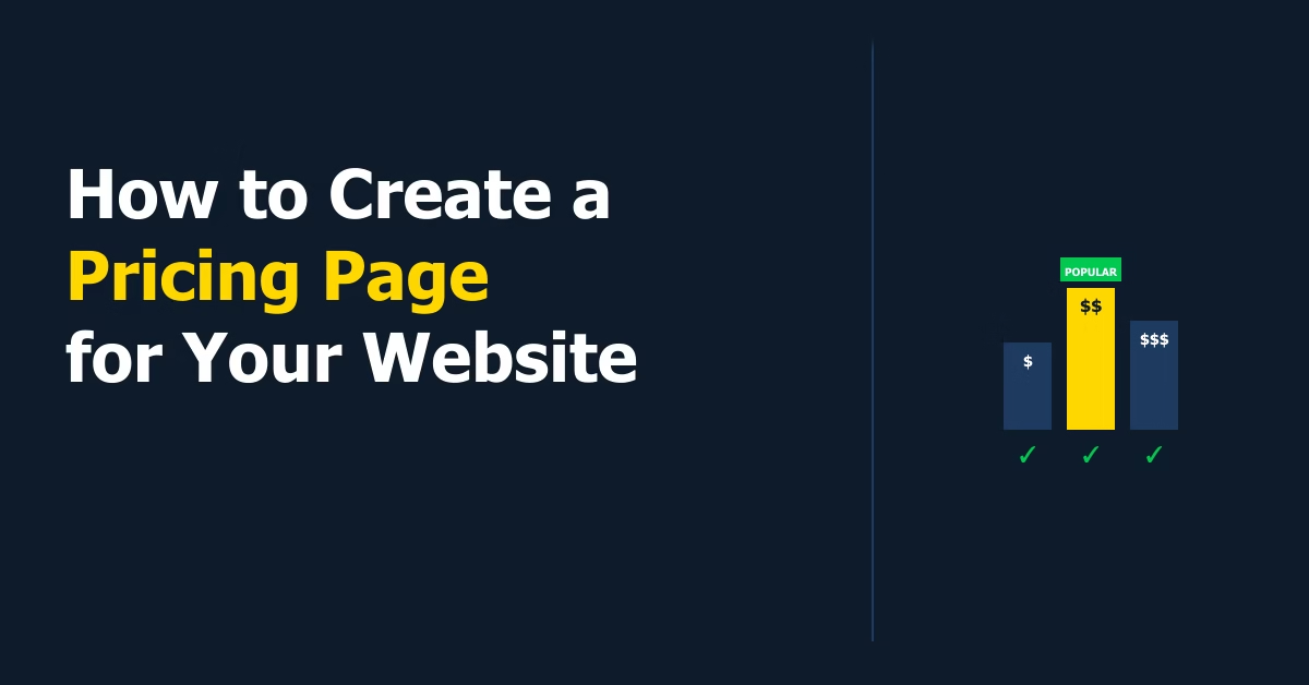
The most effective and widely used layout is a side-by-side comparison with 2–4 columns, one per plan. Each column has a header (plan name), price, feature list, and button. This works because it lets visitors compare options at a glance.
For WordPress, most page builders include a pricing table block or module. You can also use a dedicated plugin — Easy Pricing Tables is a well-maintained option with Gutenberg block support and 10,000+ active installs. If your service is not tiered and a comparison table does not apply, a simple list format with a clear CTA works just as well.
3. Write Clear Plan Names and Prices
Avoid naming your plans things like Bronze, Silver, Gold — they communicate hierarchy but not meaning. Instead, name them by what they do or who they are for: Starter, Growth, Business. Or for service-based businesses: Single Page, Standard Site, Full Build.
Show the actual price where possible. If a project always requires a scoping call before you can quote accurately, say “from £x” with a brief explanation of what affects the final price. Vague pricing signals either uncertainty or a sales strategy — neither builds trust with a first-time visitor.
4. List What Is Included
For each plan, list what the visitor gets in concrete terms. Avoid generic feature names like “premium support” or “advanced features” — they mean nothing without context. Specifics work better: “5 pages built”, “contact form integration”, “12 months of hosting included”.
If you offer multiple tiers, make the differences between them obvious. A visitor should be able to look at your pricing table for fifteen seconds and understand exactly how Option B differs from Option A.
5. Add a CTA for Each Option
Every plan needs a clear next step. For service-based businesses, that is usually a button linking to your contact page or a booking form. For product-based businesses, it links directly to checkout.
The button label matters. “Get Started” is generic. “Book a Free Call”, “Start Your Project”, or “Order Now” are more specific and convert better. If you have a recommended or most popular plan, highlight it visually — a badge or coloured border draws the eye. Read up on designing effective website calls to action before finalising these buttons.
6. Add Supporting Elements
Below your pricing table, consider adding:
- A short FAQ — answer the three or four questions you get asked most often before someone buys. Common ones: “Do prices include VAT?”, “How long does a project take?”, “What if I need more pages later?”.
- Testimonials — one or two brief quotes from clients who paid similar prices reduce hesitation. If you have a dedicated testimonials page, link to it from here rather than duplicating all reviews.
- A guarantee or risk-reversal statement — even something simple like “no work starts without a signed agreement and deposit” builds confidence.
7. Keep It Scannable
Most visitors will scan your pricing page before they read it. Short bullet points, clear headings, and visible prices serve that behaviour. Long paragraphs, dense feature lists, and hidden buttons do not.
If you are building your pricing page as part of a new site, the step-by-step guide to building a WordPress website covers how to structure all the core pages together so they work as a cohesive whole.
Practical Tips for Your Pricing Page
- Anchor with a middle option. If you offer three tiers, most visitors choose the middle one. Price your tiers so the middle option is the one that best fits your typical client.
- Show prices in the currency your clients use. For a UK audience, that is pounds. Mixing currencies or using “$” when your clients pay in “£” creates unnecessary friction.
- Keep the page short. A pricing page that requires scrolling past multiple sections before reaching the price will lose visitors. Get to the numbers quickly.
- Test your contact flow. If your CTA links to a contact form, complete it yourself and confirm the submission works, the email arrives, and the thank-you page is correct.
Common Mistakes on Pricing Pages
- No prices at all. “Contact us for pricing” on every tier removes the main reason anyone visits a pricing page.
- Too many options. More than four tiers typically causes decision paralysis. Start with two or three, add a fourth only if there is a genuine use case for it.
- Vague feature descriptions. “Everything in Standard, plus more” is not a feature list. Be specific.
- Broken or missing CTAs. Every option needs a working button. Check it on mobile too — pricing tables often break on small screens when built with certain plugins or page builders.
- Outdated prices. A pricing page with prices you stopped charging six months ago creates awkward conversations. Treat it as a live document and update it whenever your rates change.
Pricing Page vs. Listing Prices on Your Service Page
Some businesses skip a dedicated pricing page and include prices directly on their service page instead. This works for simpler offers — if you have one service at one price, a separate pricing page adds unnecessary structure.
A dedicated pricing page makes sense when you have multiple tiers worth comparing side by side, when pricing is complex enough to need its own FAQ, or when you want a distinct URL to link to from ads or email campaigns. If your service page already handles pricing clearly and concisely, do not duplicate it — keep pricing there and skip the separate page.
A pricing page works well alongside a dedicated offer page — if you are promoting one specific package rather than letting visitors compare tiers on their own, see how to create a sales page in WordPress for a structure built to close that decision directly.
Conclusion
A pricing page does not need to be elaborate to work. Get the structure right — plan names, prices, what’s included, and a clear next step — and you will convert more of the visitors who arrive already interested. Start simple, review it after your first handful of enquiries, and refine from there.

Etienne Basson works with website systems, SEO-driven site architecture, and technical implementation. He writes practical guides on building, structuring, and optimizing websites for long-term growth.