The homepage hero section is usually the first thing visitors see when they land on a website. In many WordPress sites, this section decides whether someone keeps reading, clicks a button, or leaves the site entirely.
I regularly see websites with hero sections that look visually impressive but fail to explain what the website actually offers. Sometimes the headline is too vague, the call to action is unclear, or the layout pushes important information too far down the page.
A good hero section does not need complicated animations or expensive design work. In most WordPress sites I build, the best-performing hero sections are usually simple, clear, and focused on one goal.
Quick Answer
A good WordPress homepage hero section should clearly explain what the website offers, who it is for, and what visitors should do next. Most effective hero sections include:
- A clear headline
- A short supporting description
- A primary call to action button
- A relevant image or visual
- Enough spacing to keep the layout easy to read
The goal is clarity before design effects.
Why the Homepage Hero Section Matters
The hero section affects both usability and conversions.
When visitors arrive on a website, they usually decide within a few seconds whether the page looks relevant. If the hero section is confusing or overloaded, people often leave before exploring the rest of the site. Research from Nielsen Norman Group has consistently shown how quickly users form impressions about websites and usability.
This section also helps guide visitors toward important actions such as:
- Contacting your business
- Reading articles
- Booking a service
- Joining an email list
- Viewing products
- Requesting a quote
A clear hero section can improve engagement because visitors immediately understand the purpose of the website.
From an SEO perspective, strong homepage messaging can also help search engines better understand the topic and focus of the site. A well-designed hero section also works better when it fits into a clear overall site structure and navigation strategy. If you are still planning your layout, read Website Structure Explained How to Plan Pages and Navigation for SEO.
What a Good Hero Section Usually Includes
Most effective homepage hero sections follow a simple structure.
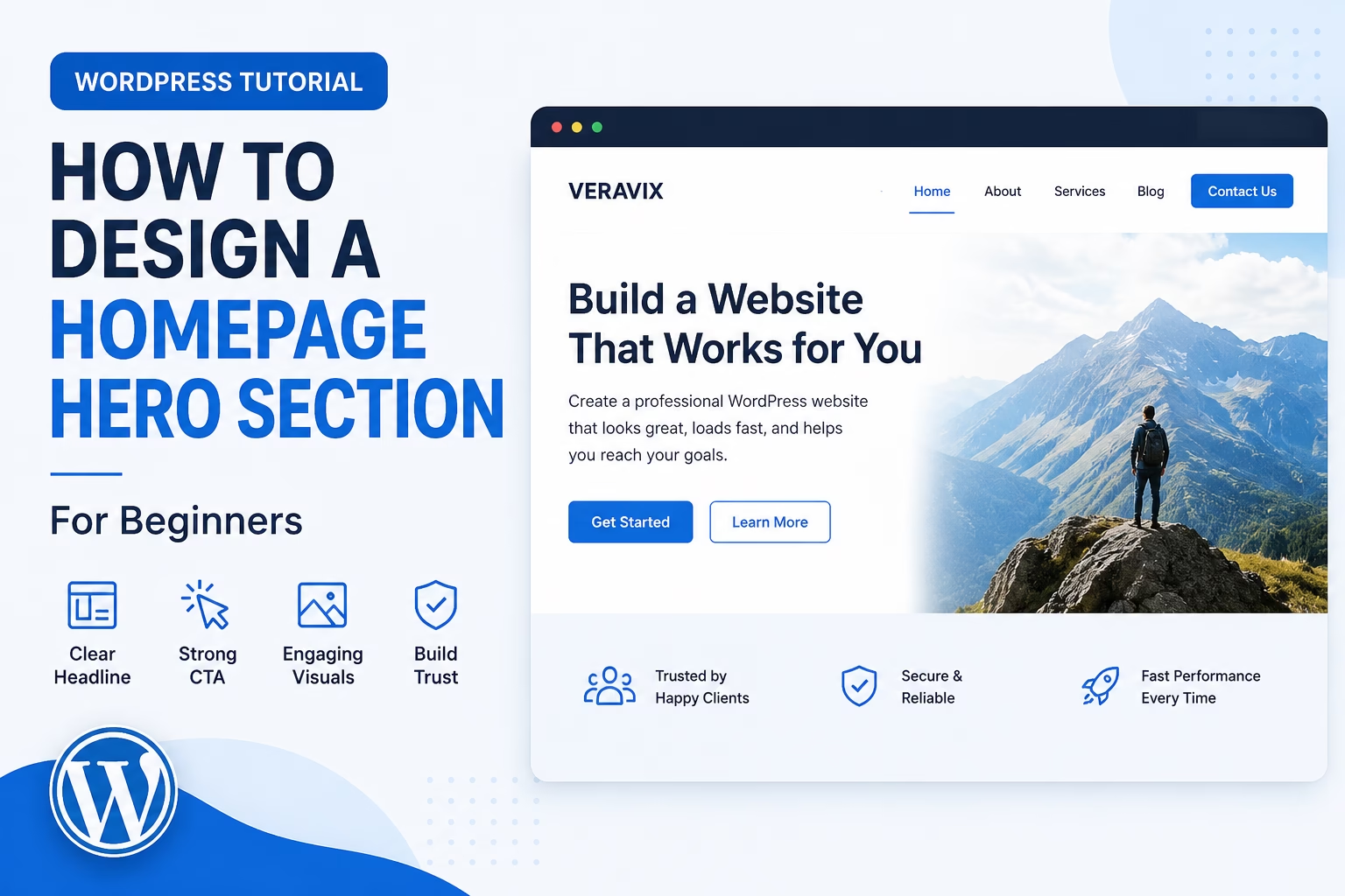
1. A Clear Headline
The headline should explain what the website offers as quickly as possible.
Avoid vague headlines like:
- “Building Better Digital Experiences”
- “Creative Solutions for Modern Businesses”
- “Helping You Grow Online”
These phrases sound polished but do not explain anything specific.
Instead, use direct headlines that immediately describe the service or purpose of the site.
Examples:
- “WordPress Website Design for Small Businesses”
- “Step-by-Step WordPress Tutorials for Beginners”
- “Affordable Ecommerce Websites Built with WooCommerce”
In my experience, clarity almost always performs better than clever wording.
2. A Supporting Description
Under the main headline, add a short paragraph that explains the benefit or outcome.
This text should expand on the headline without repeating it.
For example:
“Learn how to build, design, and improve your WordPress website with practical tutorials focused on SEO, structure, and real-world setup.”
Keep this section concise. Long paragraphs usually reduce readability in hero sections.
3. A Primary Call to Action Button
The call to action should tell visitors exactly what to do next.
Examples include:
- Start Here
- View Tutorials
- Get a Quote
- Contact Us
- Browse Services
- Download the Guide
Avoid generic button text like “Learn More” when possible.
The button should stand out visually without overwhelming the design.
4. A Relevant Image or Visual
Most hero sections work better with some type of supporting visual.
This could include:
- A website mockup
- A screenshot
- A workspace image
- A product image
- A simple branded illustration
The image should support the message rather than distract from it.
I usually recommend avoiding large stock photos that do not relate to the actual website or service.
5. Enough Spacing
Spacing is one of the easiest ways to improve a homepage layout.
Crowded hero sections feel harder to read and often look unprofessional.
Adding padding around headings, buttons, and images makes the layout easier to scan.
How to Build a Homepage Hero Section in WordPress
The exact process depends on your WordPress setup, but the overall structure remains similar.
Step 1: Open Your Homepage
In WordPress:
- Go to Pages
- Open your homepage
- Edit the page using the Block Editor, Elementor, Kadence Blocks, Spectra, or your preferred page builder
Most modern WordPress themes support flexible hero section layouts.
Step 2: Add a Full-Width Section or Container
Create a section near the top of the page.
Most hero sections use:
- Two-column layouts
- Large spacing
- Centered vertical alignment
- A contrasting background
Typically, one side contains the text while the other side contains the image.
If you use the default Block Editor, you can build this with:
- Group blocks
- Columns blocks
- Cover blocks
- Buttons blocks
Step 3: Add the Main Headline
Use an H1 heading for the primary title.
The homepage should usually contain only one H1 heading.
Keep the headline easy to scan.
Long headlines often reduce readability, especially on mobile devices.
Step 4: Add Supporting Text
Place a short paragraph below the headline.
Focus on:
- What the visitor gains
- Who the content or service helps
- Why the website matters
Avoid adding too much information in the hero section itself.
Step 5: Add a Call to Action Button
Insert a clear button below the supporting text.
The button should link to:
- A contact page
- A service page
- A tutorial category
- A signup page
- A product page
I usually recommend limiting the hero section to one primary button unless there is a strong reason for adding a secondary option.
Step 6: Add a Supporting Image
Upload an optimized image that supports the page message.
Before uploading:
- Compress the image
- Resize it properly
- Use descriptive file names
- Add alt text
Large unoptimized hero images are a common cause of slow homepage performance.
Step 7: Test the Mobile Layout
A hero section may look good on desktop but break on mobile.
Always test:
- Heading size
- Button spacing
- Image alignment
- Text readability
- Section height
In many WordPress themes, mobile spacing adjustments are necessary.
Practical Tips for Better Hero Sections
Keep the Main Goal Clear
Every hero section should support one main action.
Trying to promote too many things at once often weakens the layout.
For example, avoid combining:
- Newsletter signup
- Product promotion
- Multiple services
- Several buttons
- Large menus
inside the same opening section.
Avoid Sliders
Homepage sliders were common for years, but they often reduce usability.
Visitors frequently ignore rotating banners, and sliders can slow down page speed.
In most sites I review, a single focused hero section performs better than multiple rotating slides.
Use Realistic Design Choices
Simple layouts usually age better than highly trendy designs.
Clean typography, readable spacing, and clear messaging often outperform overly animated layouts.
Match the Hero Section to Search Intent
If visitors arrive from Google, the hero section should reinforce the page topic immediately.
For example, if someone searches for WordPress SEO help, the homepage should clearly mention WordPress SEO rather than generic business messaging.
Common Homepage Hero Section Mistakes
Vague Headlines
One of the biggest problems is unclear messaging.
If visitors cannot immediately understand what the site does, many will leave.
Too Much Text
Large blocks of text reduce readability.
The hero section should introduce the page, not explain everything.
Weak Contrast
Poor color contrast makes text difficult to read.
This is especially common with image backgrounds.
Always test readability across devices.
Overusing Animations
Animations can be useful in moderation, but too many moving elements often make websites feel distracting.
Heavy animations can also affect performance.
Poor Mobile Layouts
Many homepage hero sections are designed only for desktop screens.
Mobile usability should always be checked manually.
When to Use Different Hero Section Styles
Different websites may require different hero section approaches.
Service Websites
Usually benefit from:
- Strong headline
- Trust-focused messaging
- Contact button
- Clean professional layout
Ecommerce Websites
Often use:
- Product-focused visuals
- Promotional messaging
- Category links
- Featured products
Blogs and Tutorial Websites
Typically perform well with:
- Topic-focused headlines
- Search-oriented messaging
- Clear navigation to categories or tutorials
Portfolio Websites
May rely more heavily on visuals while still keeping the core message clear.
The structure should always support the purpose of the website rather than following design trends.
Once your hero section is built, make sure the call to action actually converts. Clear button text, strong colour contrast, and removing competing links around the CTA all make a difference — see how to design website calls to action in WordPress for the full walkthrough.
Once the visual design of your hero section is sorted, the next task is getting the words right. See the guide to writing homepage copy for a new website — it covers how to structure your headline, proof elements, and calls to action so visitors understand what you offer and what to do next.
Final Thoughts
A homepage hero section does not need complicated design elements to work well.
Clear messaging, a focused layout, readable spacing, and a strong call to action usually matter more than visual effects.
When I build WordPress sites, I generally focus on clarity first and styling second. Visitors should immediately understand what the website offers and where they should go next.
That simple approach usually creates a better experience than trying to make the homepage look overly complex.

Etienne Basson works with website systems, SEO-driven site architecture, and technical implementation. He writes practical guides on building, structuring, and optimizing websites for long-term growth.