Many new WordPress websites feel crowded even when the design itself looks modern. The problem is often not the colors, fonts, or images. It is usually spacing.
When pages are packed too tightly, visitors struggle to scan content, buttons become harder to notice, and the entire website feels more difficult to use. I see this often on websites where people try to fit too much information into one screen because they want visitors to “see everything immediately.”
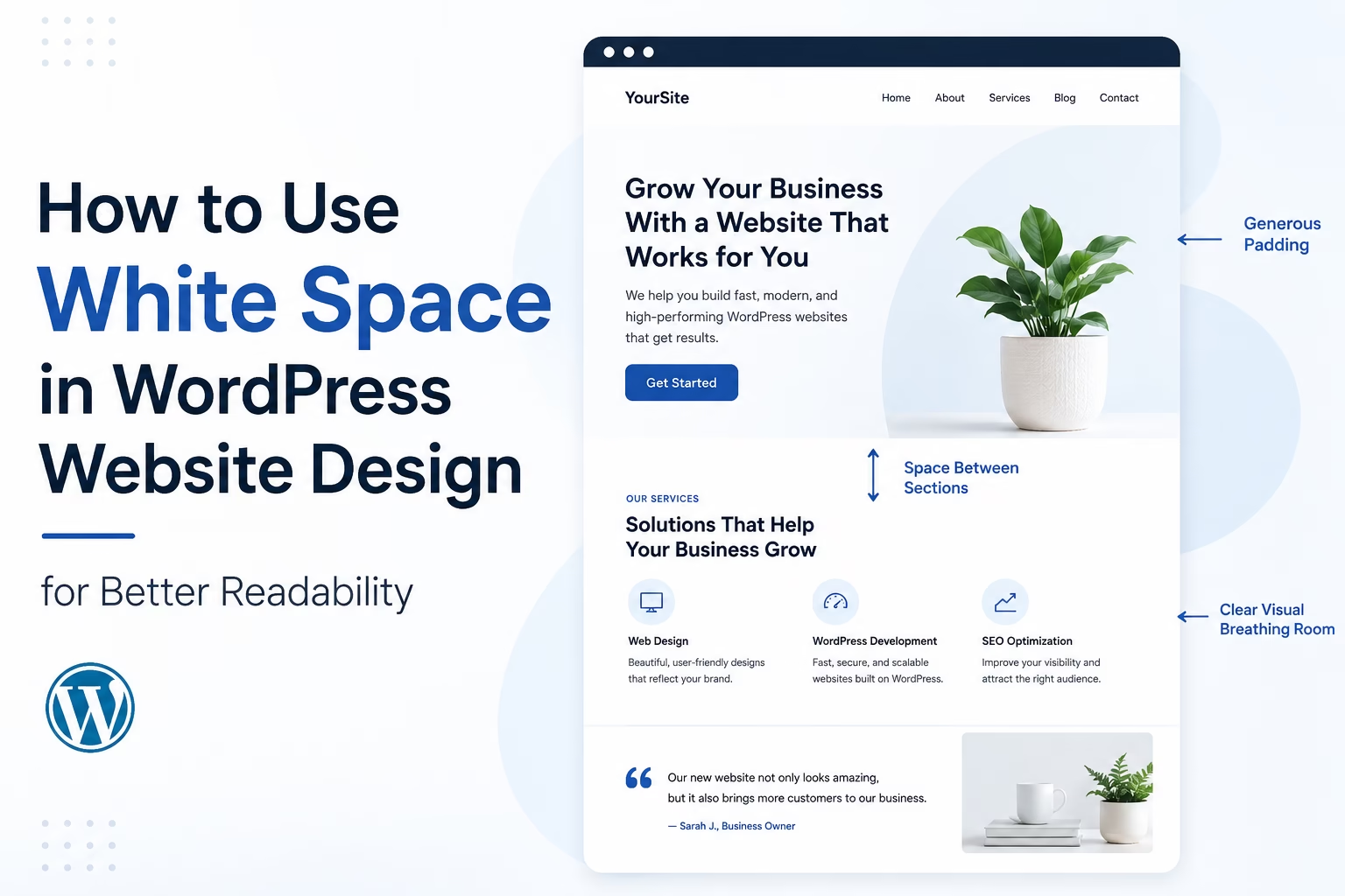
In practice, better spacing usually improves a website faster than adding more design elements. Simple changes to margins, padding, section spacing, and text layout can make a WordPress site feel cleaner and easier to read without rebuilding the entire design.
Quick Answer
White space in website design is the empty space between sections, text, images, buttons, and other elements on a page. Good use of white space improves readability, makes layouts easier to scan, and helps visitors focus on important content.
In WordPress, white space is controlled through theme settings, block spacing, padding, margins, line height, and layout structure.
Why White Space Matters on a WordPress Website
White space affects both usability and perception.
A crowded website often feels unprofessional even when the content is useful. Visitors become overwhelmed when every section competes for attention at the same time.
Good spacing helps:
- Improve readability
- Make navigation easier
- Highlight calls to action
- Create visual hierarchy
- Reduce bounce rates
- Improve mobile usability
- Make a website feel more modern and trustworthy
In most sites I build, improving spacing is one of the fastest ways to improve the overall appearance without changing the branding or content itself.
White space also supports SEO indirectly because users stay engaged longer when content is easier to consume.
Types of White Space in Website Design
White space is not only large empty areas between sections. It exists throughout the entire layout.
Micro White Space
This includes small spacing areas such as:
- Space between lines of text
- Space between paragraphs
- Button padding
- Space between menu items
- Gaps between images and text
Micro spacing affects readability more than people realize.
Macro White Space
This refers to larger layout spacing such as:
- Space between sections
- Margins around content containers
- Empty areas in hero sections
- Padding around featured content
Macro spacing creates structure and helps visitors understand page flow.
How to Improve White Space in WordPress
1. Increase Paragraph Spacing
Large blocks of text are difficult to read online.
Break long paragraphs into shorter sections and leave visible spacing between them.
Most WordPress themes already support paragraph spacing automatically, but some themes compress content too tightly.
In the Block Editor:
- Select a paragraph block
- Open the block settings sidebar
- Adjust typography or spacing settings if available
I usually recommend keeping paragraphs between 2–4 lines for standard desktop reading.
2. Use More Space Between Sections
One of the most common mistakes is stacking sections too closely together.
For example:
- Hero section
- Features section
- Testimonials
- Contact form
If these sections touch each other visually, the page feels crowded.
In WordPress Block Editor:
- Select the parent container or Group block
- Open the Styles tab
- Increase padding or block spacing
Most modern themes allow section padding adjustments directly inside the editor.
3. Improve Line Height for Readability
Text that sits too tightly together becomes difficult to scan.
Line height controls vertical spacing between text lines.
For blog content, a line height around 1.5 to 1.8 usually works well.
To adjust this in WordPress:
- Select a text block
- Open Typography settings
- Adjust Line Height
When I review WordPress sites with poor readability, compressed line spacing is one of the most common problems.
4. Avoid Overcrowding the Homepage
Many homepage designs fail because they try to show everything at once.
You do not need:
- Every service
- Every testimonial
- Every blog category
- Multiple popups
- Several calls to action above the fold
Instead, create clear separation and guide visitors through the page gradually.
White space gives important content room to stand out.
5. Add Space Around Buttons and Calls to Action
Buttons placed too close to text or other elements become harder to notice.
Good spacing around calls to action improves visibility and click rates.
Examples:
- Add padding inside buttons
- Leave space above and below buttons
- Avoid placing multiple buttons tightly together
This becomes especially important on mobile devices.
6. Use Content Width Properly
Very wide text areas reduce readability.
Most content sections should not stretch across the full screen width on desktop.
If you are also adjusting your overall page structure, see How to Choose a Website Layout for a New WordPress Website for practical layout planning tips that work well alongside better spacing.
A narrower content container creates a more comfortable reading experience.
In WordPress themes or page builders, look for:
- Container width
- Content width
- Layout width
- Max-width settings
In my experience, websites become noticeably easier to read once text width is controlled properly.
7. Use White Space in Mobile Design
Spacing problems become worse on smaller screens.
A layout that feels acceptable on desktop may feel cramped on mobile.
Check:
- Paragraph spacing
- Button spacing
- Menu spacing
- Section padding
- Image spacing
Always preview pages on mobile before publishing changes.
Common White Space Mistakes
Using Too Many Small Elements Together
Too many widgets, icons, badges, and buttons create visual clutter.
Simplifying layouts often improves usability more than adding extra features.
Removing Space to “Fit More Content”
This usually hurts readability.
Visitors rarely read crowded pages carefully.
Ignoring Mobile Spacing
Desktop layouts do not automatically translate well to mobile screens.
Spacing should be checked separately on smaller devices.
Using Full-Width Text Blocks
Wide text lines are harder to scan and tire the eyes faster.
Inconsistent Section Spacing
Some sections may have large padding while others have almost none.
Consistent spacing helps pages feel organized.
When to Use More Minimal Spacing
Not every website needs large open layouts.
For example:
- Ecommerce category pages may need denser layouts
- Directory websites often prioritize compact listings
- Dashboards and admin areas usually use tighter spacing
But informational websites, blogs, service sites, and landing pages generally benefit from more generous white space.
White Space vs Minimalism
White space is not the same thing as minimalist design.
A website can still contain:
- Images
- Colors
- Visual sections
- Strong branding
while using spacing effectively.
The goal is clarity, not emptiness.
Tools and Features That Help With White Space in WordPress
Useful WordPress features include:
- Group blocks
- Stack blocks
- Columns blocks
- Container controls
- Global spacing settings
- Page builders with responsive spacing controls
Themes like Astra, Kadence, GeneratePress, and Blocksy usually provide good spacing controls without requiring custom CSS.
Google also highlights readability and visual simplicity as part of a good page experience in its helpful content guidelines, which is another reason clean spacing and readable layouts matter.
Conclusion
White space is one of the simplest ways to improve a WordPress website without redesigning the entire layout.
Better spacing improves readability, creates cleaner page structure, and helps visitors focus on important content. In many cases, removing clutter and adding breathing room produces a bigger improvement than adding more design elements.
When adjusting your website, focus on paragraph spacing, section padding, readable content width, and mobile spacing first. Those small changes usually make the biggest difference quickly.

Etienne Basson works with website systems, SEO-driven site architecture, and technical implementation. He writes practical guides on building, structuring, and optimizing websites for long-term growth.